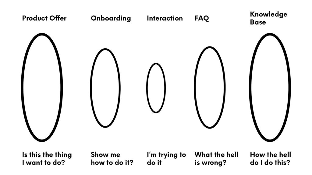
This is quick post about wayfinding and FAQ (Frequently Asked Question) webpages. There is a lot wrong in the above diagram I drew during a BlueSky chat but, as with most of the artefacts I make, it’s an attempt to clarify to myself a few questions and to try and provoke some answers from people who know more than I do (which is almost everyone as I am very much a generalist).
Everyone seems to think FAQs are bad. They demonstrate a failure of design in content or UX clarity. The FAQ as a bandaid of better explanations, clearer ways of working and errata.
This raises a few questions for me.
FAQ – when?
When is the FAQ supposed to be read?
In the diagram above, it is post-interaction with product/service. The person has attempted an interaction and come away confused and injured (in sense that the interaction may have demanded much of them but they have not achieved their desired goal). The FAQ therefore is a place of recovery and repair (the bandaid metaphor). A person tries to use the system but fails. They want to try again and the FAQ offers a way to learn, adjust or correct their way of interacting.
But what if the FAQ is where (when?) the person starts. This is where I get confused between FAQ as correction and FAQ as onboarding that provides direction.
In accessible wayfinding (which is what I do), the building up of cognitive maps and the pre-learning of places and their usability is important. We design and offer maps that have differing levels of detail and information as we cannot be sure what the person wants to do. Providing the totality of information for a place is useless: it means the person needs to take on the full weight of data and then sort out what they need. We start with simple maps to provide a general sense of place and a few opening ideas of what symbols mean or actions are possible. This is a form of onboarding.
Offering a sequence of information before the interaction is good for agency and autonomy.
So are FAQs a sign of bad onboarding or bad timing?
FAQ – who?
That leads to another question. Who are FAQ (and Knowledge Bases) for?
The diagram is simple and wrong in that it assumes the person is a first-time user, a fairly inept person and a person with no interest in becoming more expert. The user journey in emotional terms is all about confusion and distress.
That is not true. It is one use case.
What about people who encounter the product or service and want to be more expert before their interaction? What about people who interact and want to do more or do it better?
These are areas of professional skill and gaming passion. Starting as a learner, becoming adept and wanting more understanding. The FAQ and the Knowledge Base as school and college for people wanting first to understand better what they just did and wanting to learn more about what to do next time.
Wayfinding is not necessarily a great model for this kind of work. It is biased to guiding new people thru new places. A lot of the design is discarded once the people know what to do (certainty) and that they can do it again satisfactorily (confidence).
The Who? question shifts to education and learning.
Are the FAQ and Knowledge Base learning assets rather than wayfinding assets?
FAQ knows
That is the two questions I was thinking about when drawing the diagram.
I am aware I am wrong and it is in places I neither have neither the knowledge nor experience of.
FAQ when?
FAQ who?