Living in the future that stopped
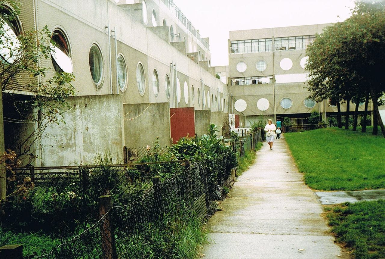
The Southgate Estate in Runcorn New Town (pictured above) was designed by James Stirling (the British excellence in architecture prize is named after him) and was finished in 1977.
The estate was demolished in 1990–1992.
The estate was filmed in the mid-1980’s for a pan-European TV series called “Architecture at the Crossroads” (a few episodes are on BBC iPlayer if you’re in the UK). It was criticised as a failure because it was Modernist. Modernism, at that point in time, was viewed as humourless and out of scale with humans and human activity. More particularly, the estate was designed with an almost Mondrianeque level of “machine for living”. People would be allocated and slotted into it as parts.
This sense of people as parts and architects as coordinator disrespected people. More especially if disrespected people who has no choice in where they were allocated. As with new estates near London and Glasgow, people without money or power were shifted en bloc to new estates, designed around new and unproven ideals of living and left without instruction or support.
The estates failed as the architectural spaces never became human places.
Innovation, new architectures, huge scales – all ideas that are current in the digital design world now. All beginning to encounter the same failures that Modernism did before.
Designing and building digital architectures that are efficient but inhumane will fail.
Time and agency
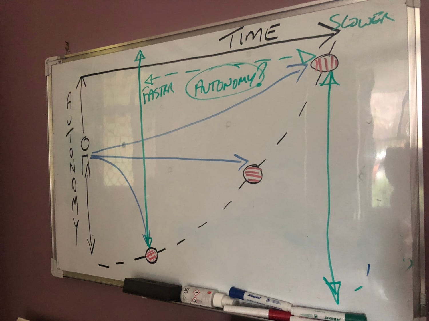
Both User Experience (UX) and Service Design (SD) seem obsessed with frictionless user journeys. The idea that a person can achieve their intent as rapidly as possible with the minimum of effort. This appears fine but it has, at least, two downsides:
- Fast does not mean full autonomy is enabled.
- Fast presumes that the limited choices offered and the final result are what the person really wants
Fast compacts down time and enables goal achievement but loses the space and time in which individual autonomy, skills and choices lie.
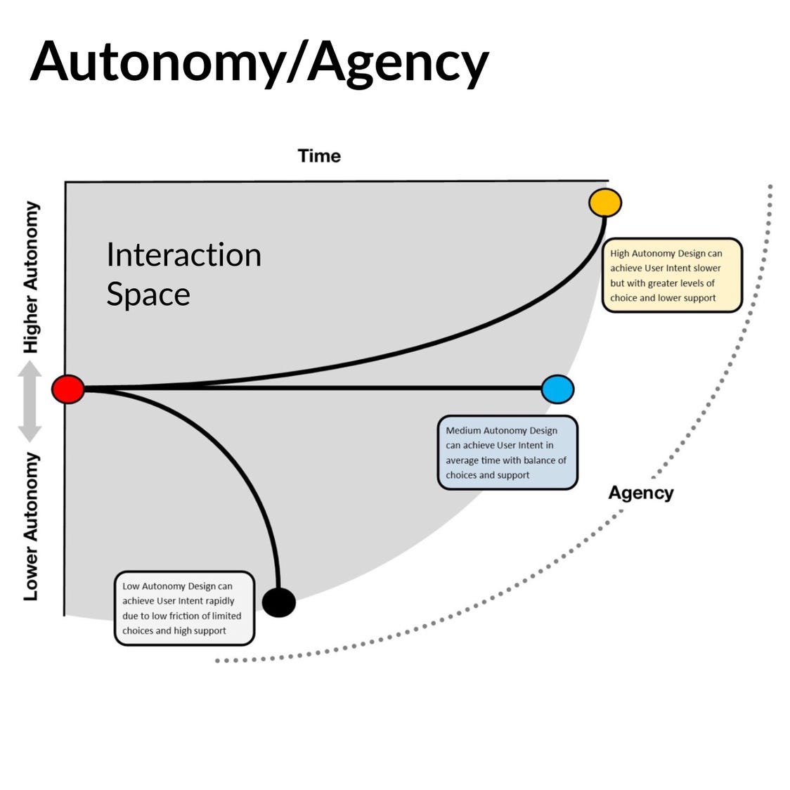
As the two diagrams above show, there are ways of considering time and autonomy. Agency (getting the thing the person needs to to do done) is possible but what the final result is and how long it takes to achieve can change radically.
There is an Autonomy Gap that can be seen between frictionless service that reduces autonomy to get to a goal fast and higher autonomy arrives that delay goal achievement to enable comprehension and skill use. Autonomy, in this context, is the ability to choose how much assistance and guidance is requested to achieve the goal. People sometimes want to use their own skills and judgement to get to the goal that meets their specific hopes and needs.*
In all this, neither low autonomy nor high autonomy is better. The issue is recognising autonomy from a human centred perspective in order to design services that flex (if required) around that human desire to have a sense of independence in accessing and choosing the service that meets their need.
Mapping autonomy in journeys
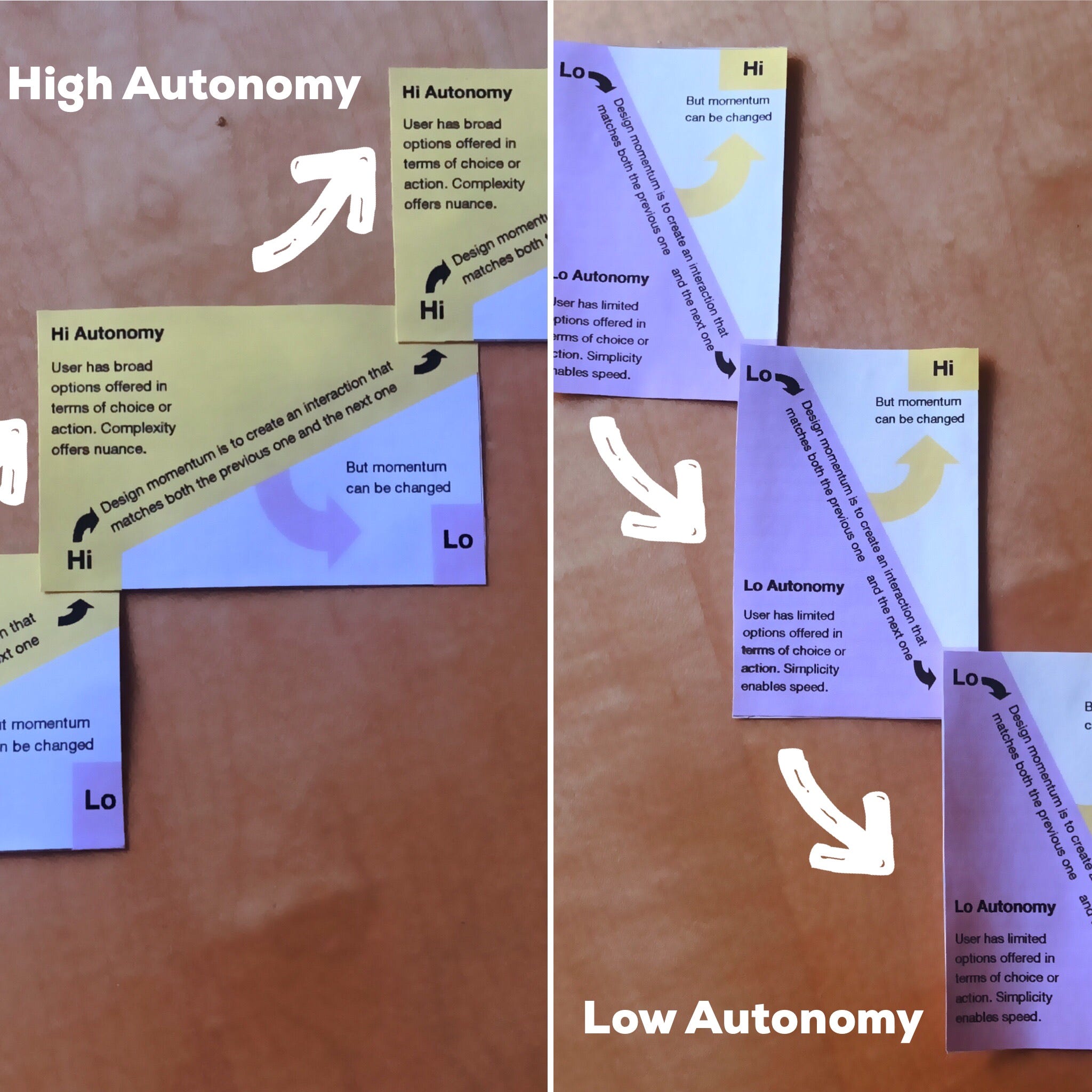
As I expect to run workshops on this issue (due to some research work in accessibility and Virtual Reality), I need a tool to help people understand the Autonomy Gap in their own work.
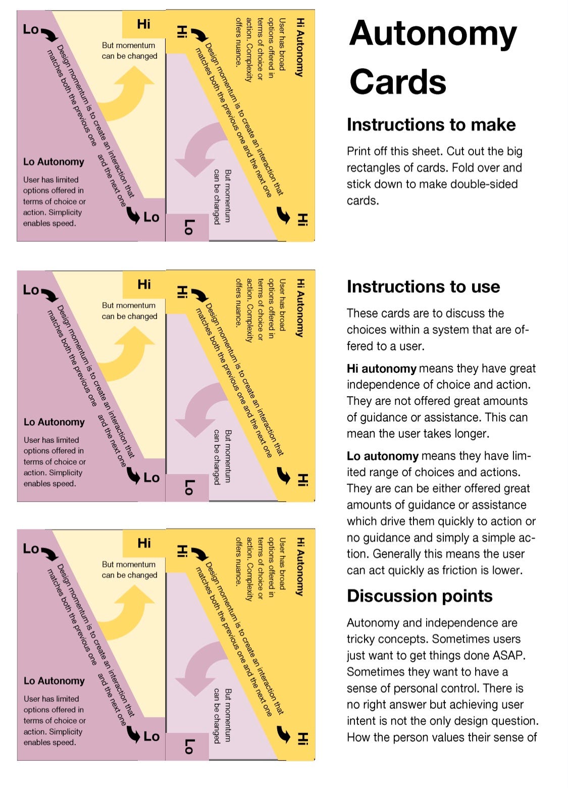
I use cards a lot to make maps and diagrams and so here are some Autonomy Cards (these are available in A4 Pdf format on Dropbox).
They are to enable people to see how design choices about reducing autonomy (to enable rapid and controlled choices) can enable very quick user journeys to very tightly defined targets.
Meanwhile, high autonomy stretches time and offers different achievements.
Momentum in design

Within the cards is the idea of momentum in interaction design. This is to highlight how frictionless design has a weight that makes limited choices/fast action more and more likely as the service proceeds.
This momentum is not scientific. It is a choice made in the process design. Making the momentum overt is a simply a way of asking workshop participants to think thru the logic of their design. A mixed approach of hi/lo autonomy is valid too. Again the point is not right or wrong but being aware enough to ask users what they want.
Independent living
Modernist public housing, like the Southgate Estate, failed as they did not enable people to live their lives as they chose. People felt disconnected and alienated in new forms today housing. Independence was not part of the architecture.
In UX and SD, the issues of respecting the desire for autonomy in life need examining. Too often design ideas all about rapid achievement of task but to a very tightly defined set of goals. As with the people allocated to estates without choice, so people pass thru systems that get to results that are defined by provider not user.
People vandalised the physical estates that treated them merely as parts to slot in. People will vandalise the digital services that treat them in the same way, but merely updated to a digital age.
The housing estates were demolished.
How long before the digital system meet the same fate?
To end here’s a quote from Mies van der Rohe mentioned in “Architecture at the Crossroads”
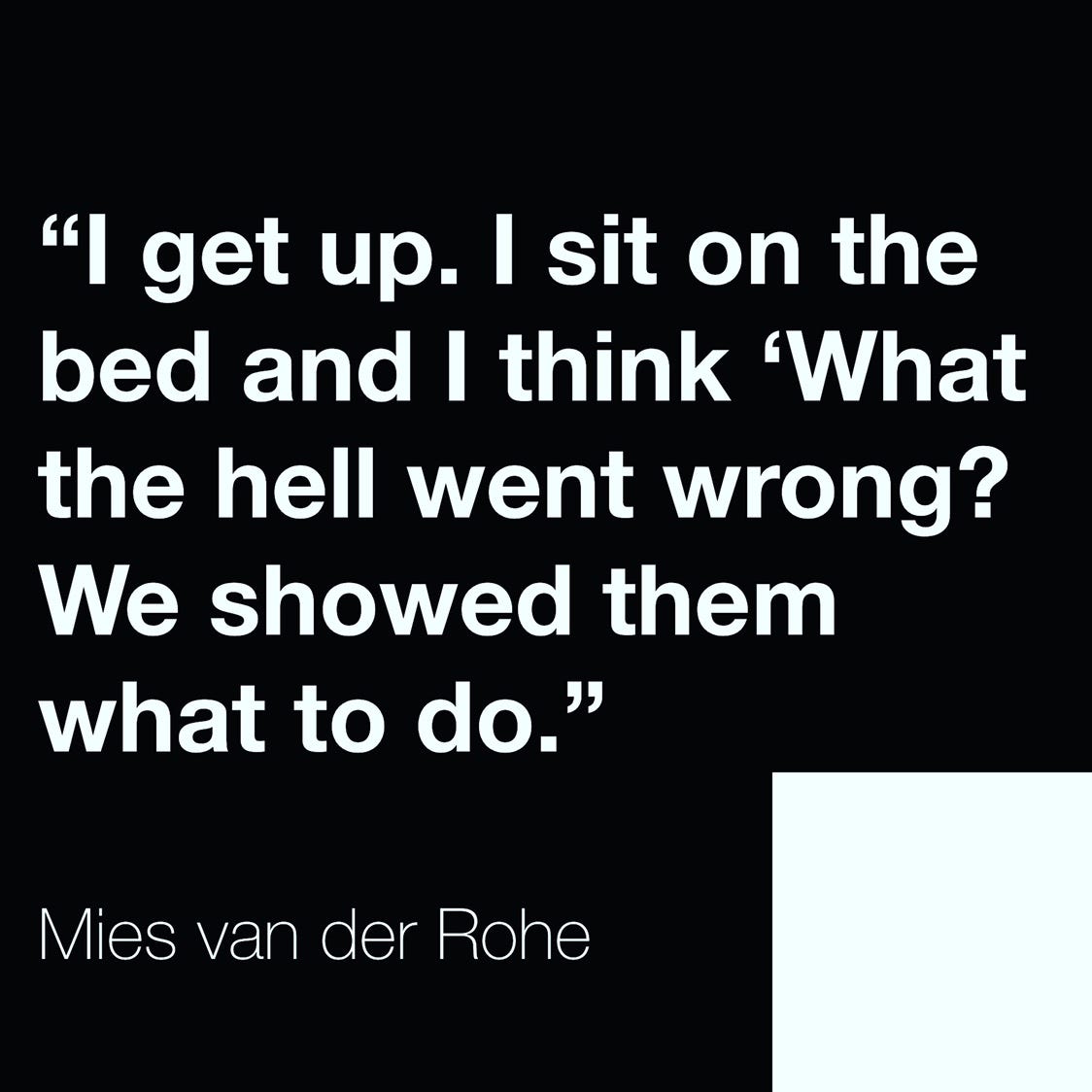
How long do we wait before asking “What the hell went wrong?”
Footnote
There’s an asterisk in the Autonomy/Agency diagram section. This is footnote is about a specific error in that section.
The diagram makes enabling autonomy look like it will always take longer. This is not true.
For expert users and people with lived experience, enabling autonomy enables them to achieve their task faster and to do it in the way that matches both their needs and their capacities.
The diagram should have an inward curve at the top to recognise this point.