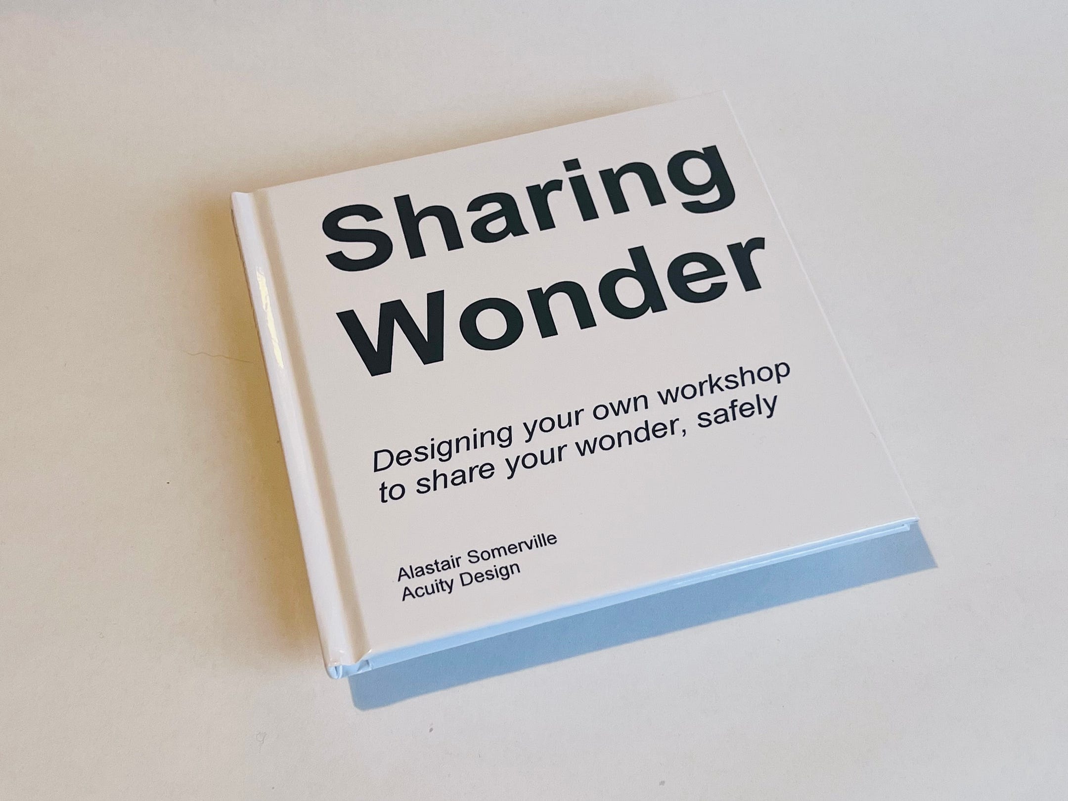
I design and facilitate a lot of different workshops. The last few years of hybrid and fully virtual workshops has meant I have adjusted a lot of ways I work. One thing I have added is physical versions of the content, like cards sent to participants. This was to try and avoid the horror of Zoom meetings of people staring at PowerPoint slides for hours.
Making physical versions of content interests me. Also I noticed how photobooks had become a product. People creating books of all millions of images captured every year.
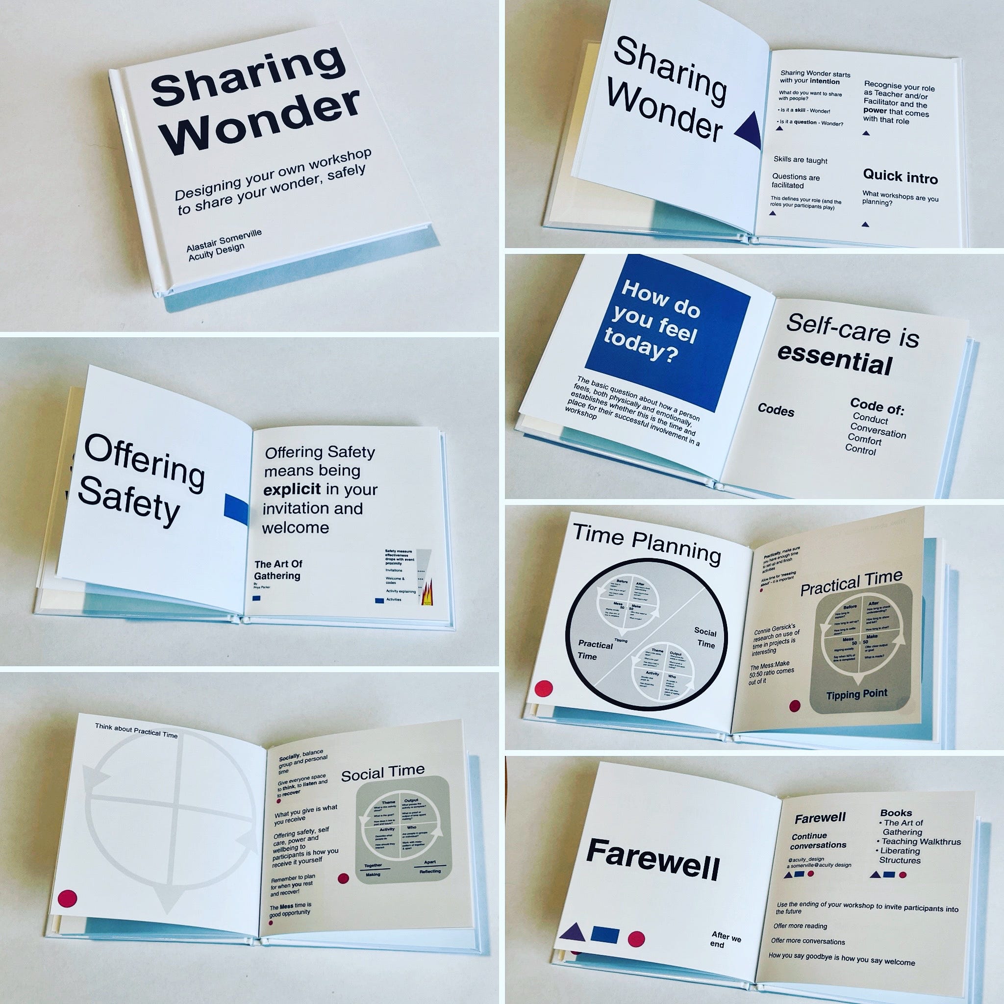
This post is about making a book from PowerPoint content. I have written about the process at the end. I start with the book as printed so as to show what can be made.
It is a fairly plain book. At one level, that is because I use very plain slides, at another it is because I wanted to just understand the process of making a book and the physicality of that book.
Sharing Wonder
This book is made from slides on designing your own workshop. The workshop has a starting sequence, three main content parts and an ending. I have added some images of each of these sections.
Visceral Check In
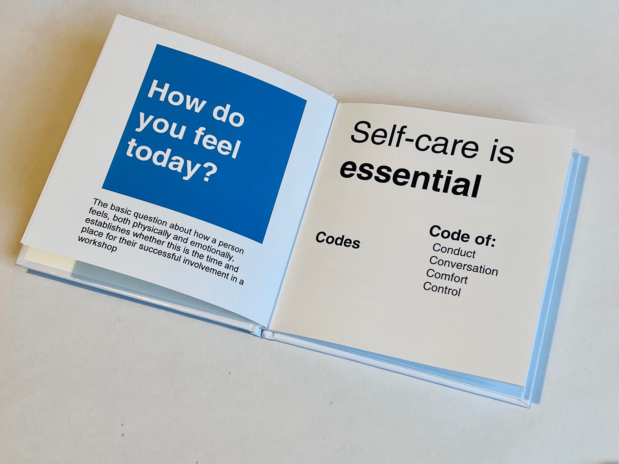
I always start a workshop with a check in on how people are feeling and stating some codes for behaviour.
This is part of self care and relates to the Offering Safety section later.
Sharing Wonder
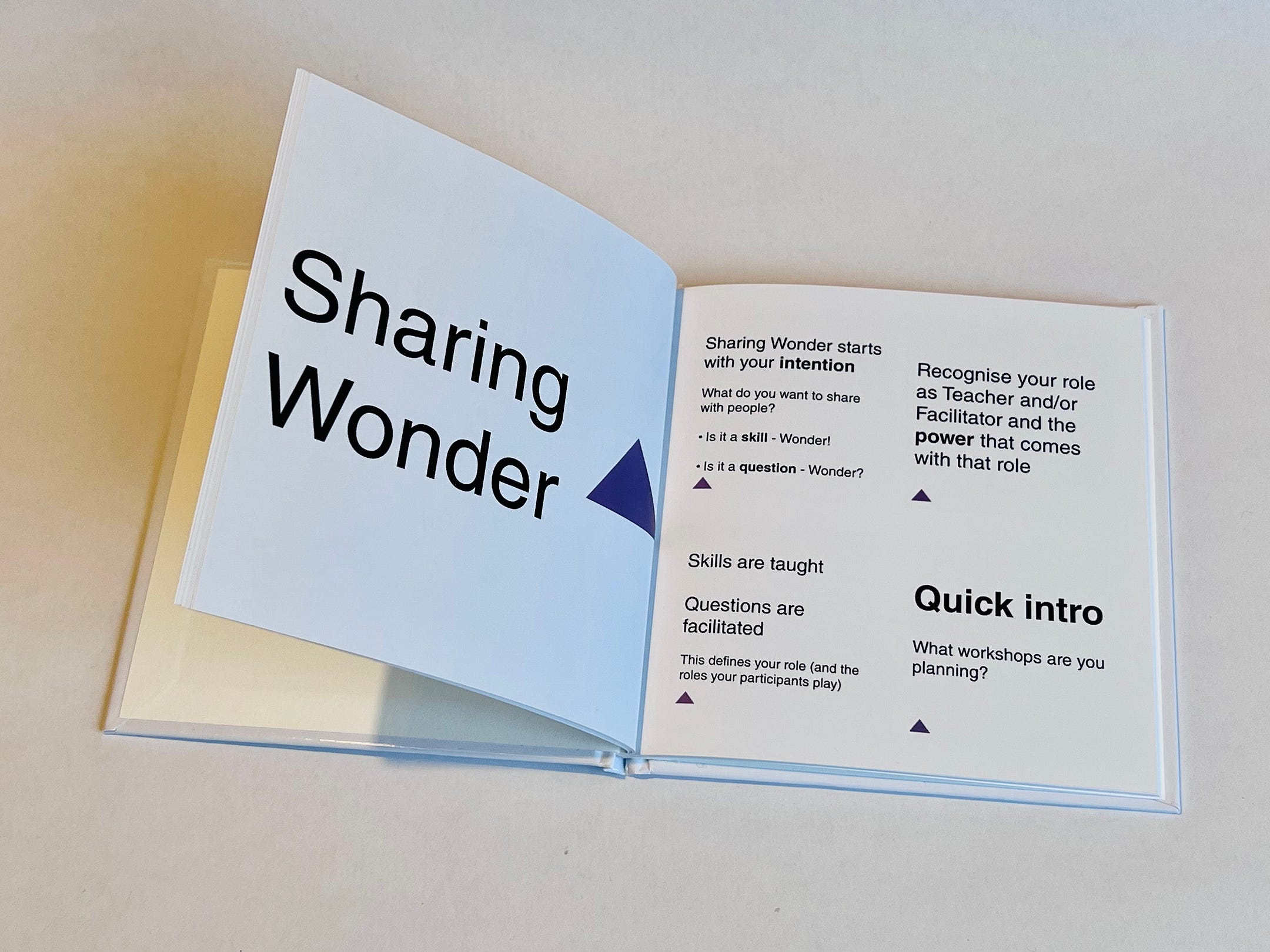
The opening part of the 3 main sections is about understanding what the content you want to share is and how that affects your role in the workshop.
Offering Safety
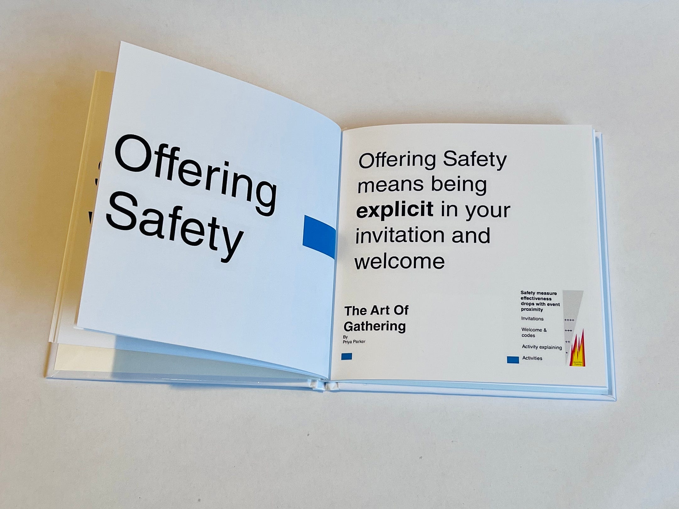
Safety is something I worry about a lot in workshops (having failed to consider it properly previously). This section covers my way of offering safety but also raises questions about differing contexts and people.
Time planning
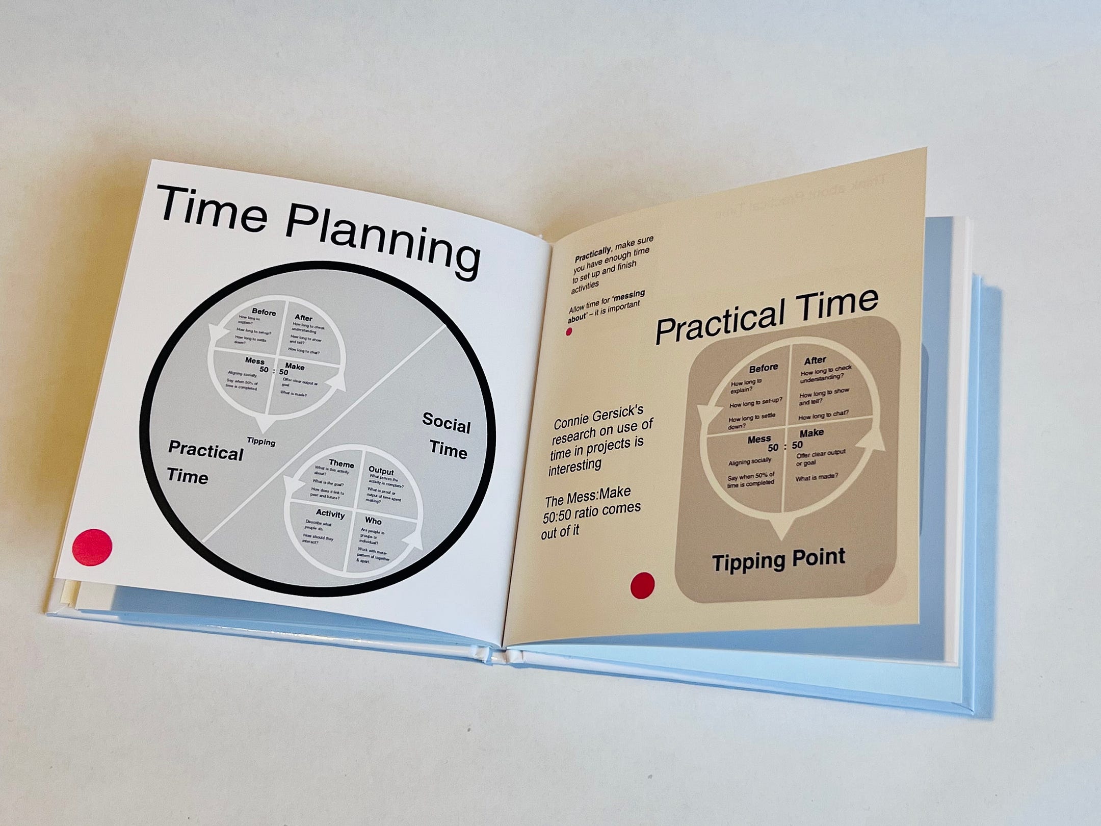
How to plan workshops in terms of activities splits into two parts. The practical issues of delivering content in time available and the social issues of working together without creating too much anxiety.
Practical Time
Social time
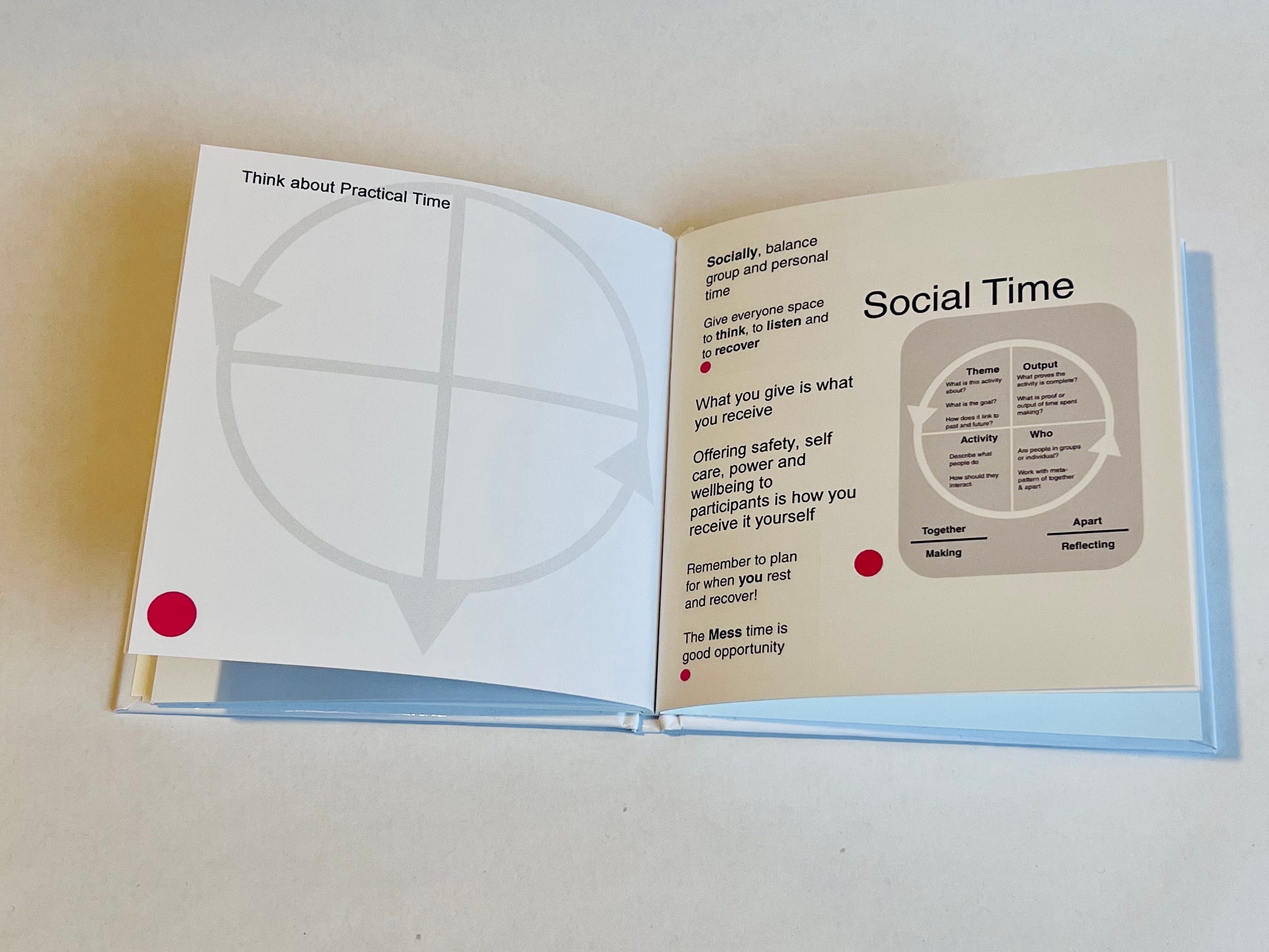
Again, it is clear that time planning relates back to self care and safety. Not merely for participants but also for you as the facilitator.
Finishing a workshop
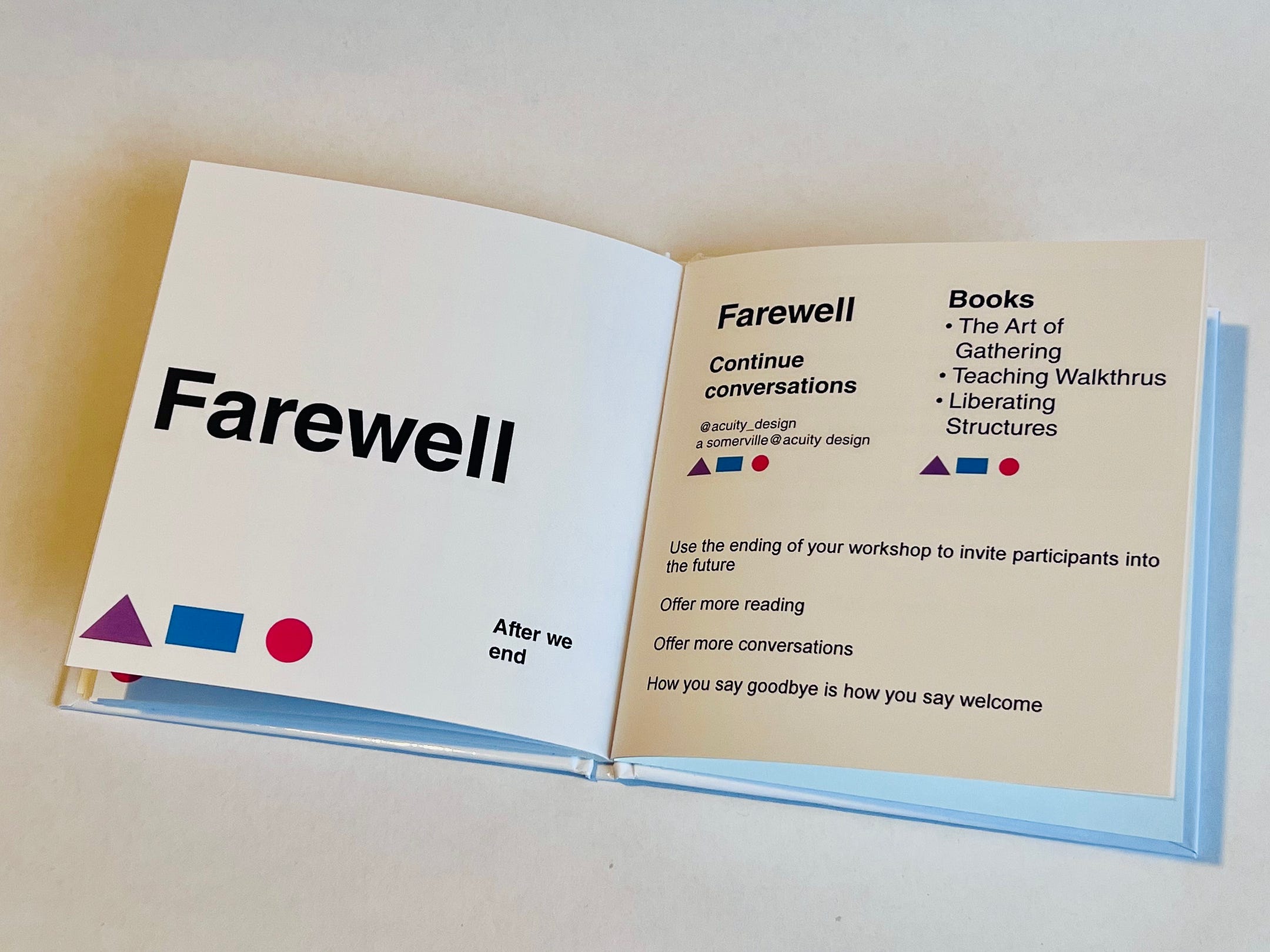
The ending of a workshop is something that I have been considering more lately. Mostly due to a discussion about how conversations can just be cut off and people silenced by an abrupt ending. The idea of Farewells and Welcomes comes from that issue.
Making a (photo)book
What I was most interested in was the production process. How to take existing content from workshops, the slides and all their text and diagrams, and transfer it into a physical book.
It is fairly easy but there are issues to watch out for that I missed (also opportunities I failed to understand).
Reformatting slides
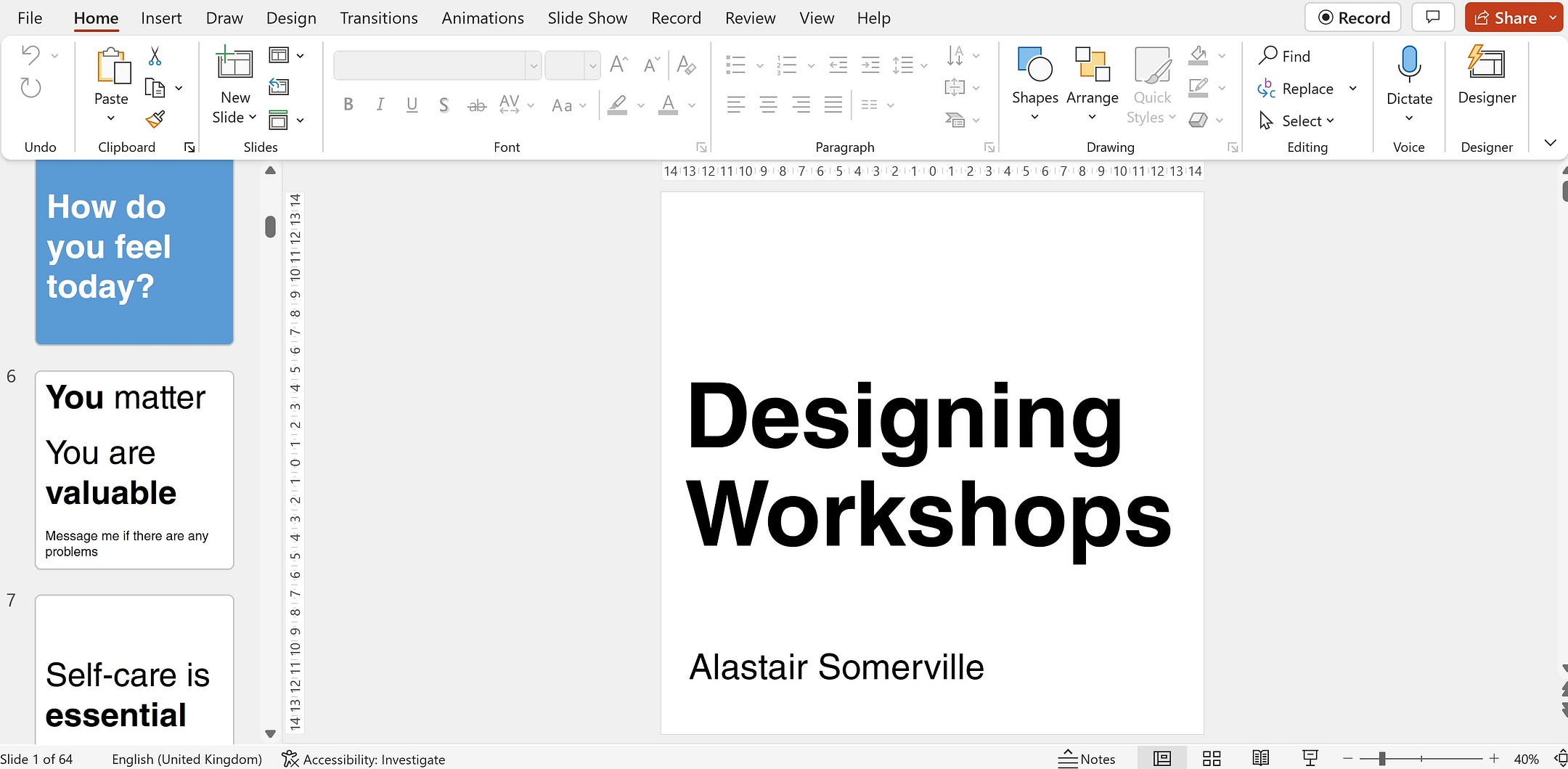
There are a couple of photobook formats, square and landscape. Neither of them match the 16:9 format that is the current standard for PowerPoint slides.
I chose to use the square format. Partially because it is marginally cheaper to print. Mostly because square matches the shape of Post It notes that many people use in workshops and when laying out their own ideas.
Reformatting slides from 16:9 to square is not hard in PowerPoint. Just changing the shape of slides is possible but text and diagrams will get restributed in odd ways. Going thru the slides page by page is necessary.
Some diagrams became too hard to reformat as content shifterd all over the place. For these I copied the slide and then pasted it as an image onto a blank square slide.
Having made the square version of the slides I exported them all as .PNG graphics. PowerPoint placed them all in a new directory.
Formatting a book
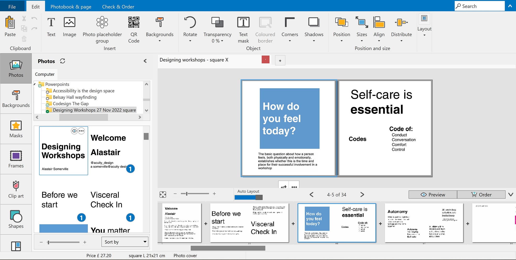
I use Vistaprint a lot for workshop materials and this experiment was due to a sale on their website. The discounts on photobooks was substantial (overall, I would say photobooks are not a truly practical way of delivering workshop content — the costs are simply too high).
Vistaprint has a downloadable app for Windows to create photobooks.
It is quite sophisticated and I did not take the opportunity in this project to explore the features. I just wanted to make a simple book and print it.
The software tries to be ‘user-friendly’ and automate the import and formatting of a photobook. For my purposes, this was chaotic.
I deleted all pre-existing photo and text boxes and made the book manually. I suspect that future books could be made more easily once a basic template is set.
I originally assumed I would just place each square slide on a page. This was not great. Firstly, it was visually dull. Secondly, it was expensive.
The book is thus a mixture of full page single images and 2 to 4 images per page. More images per page does create readability and small font problems tho.
I failed to understand how much of an image would be lost to the space near the spine. The book, as made this time, loses some readability as text is slightly hard to read near the middle. Avoid full size images with text on the right hand page in particular.
I did use the Text tool a few times to add extra context or information. The font choice is quite limited tho. Any designers who can spot the Arial and Helevetica are being mixed can be offended by this visual design horror.
In general, making the book is fairly easy and most of the hassles are in fighting the automated tools for formatting content box sizes and positions.
I did need to add a few pages to the default book. The system shows costs (pre-discount) as you along for the size you have chosen (there are 3 physical sizes: I tested with small and medium).
Finally, the book was transferred from the app to the website and there was the typical printing offers about paper quality and numbers of copies before finishing the order.
It took about 7–10 days for the books to be made and shipped.
Writing a (photo)book
I will use the books soon and see if they are useful.
I think there is some benefit in making books from PowerPoint content but it needs more work. This is just an experiment to start with.