These are some tactile and Braille interpretation materials for a new English Heritage project – read about it in this Guardian article. It was a fairly low budget project that needed fast delivery so all elements were kept simple in design terms.
However, the key point is that we made multiple pieces of media to meet differing user needs. It’s very easy just to produce one ‘iconic’ piece of accessible material and think that the job is done.
What is really required is a layered approach with chunks of material to meet people with information appropriate to their need at that time and place.
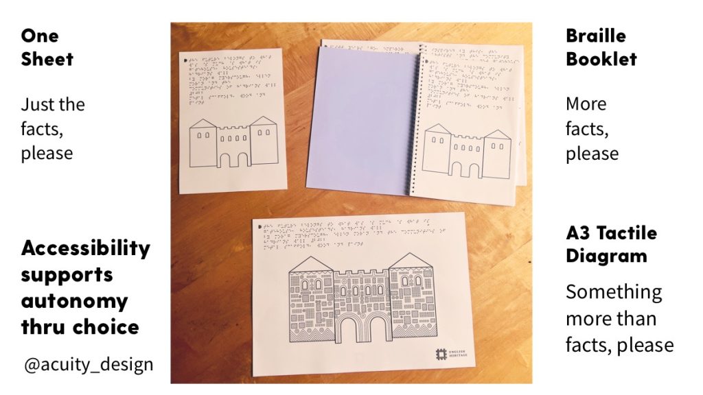
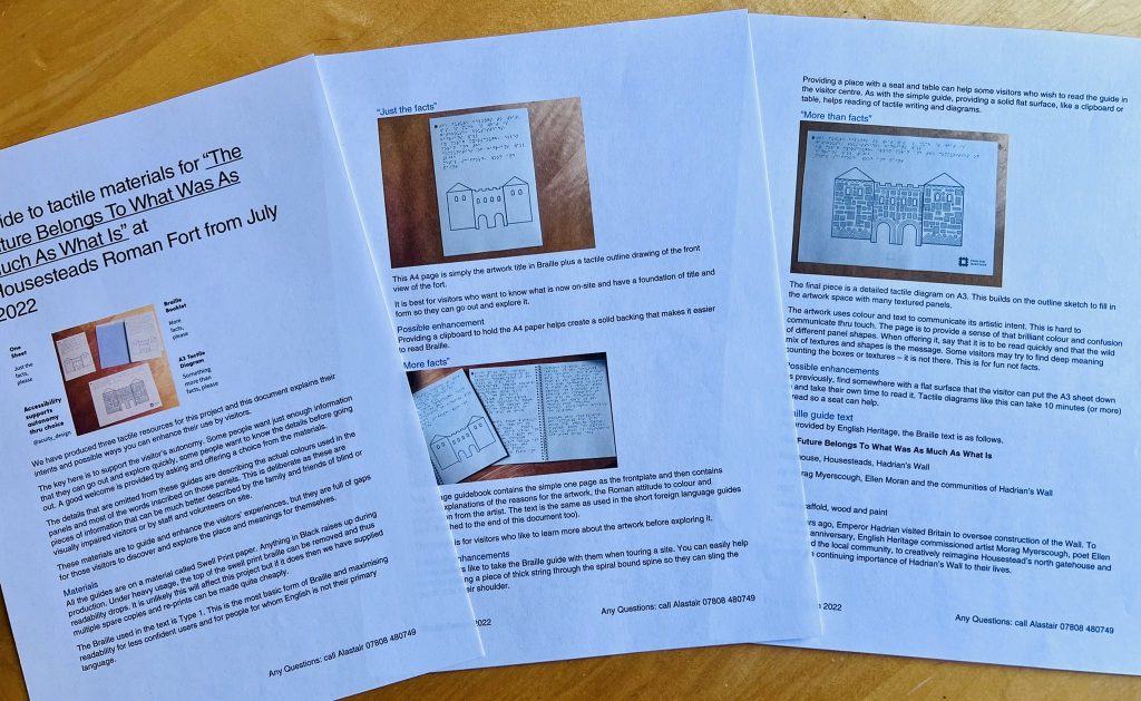
Three forms of interpretation for differing visitor requests
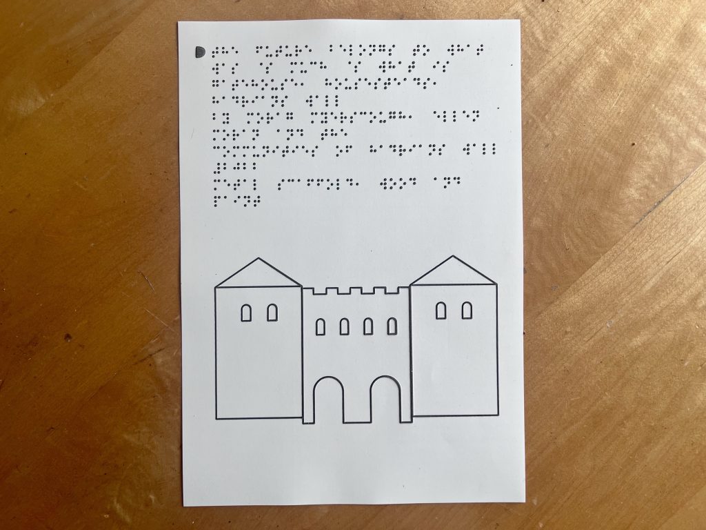
“Just the facts, please” – a simple one page with title of the artwork and a tactile outline of the shape of the architecture.
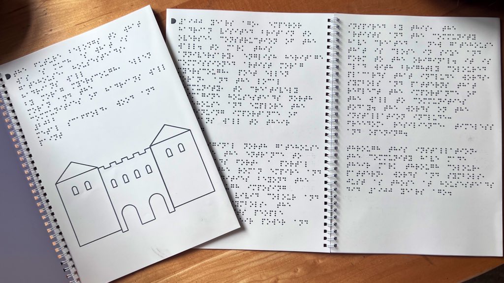
“More facts, please” – a six page Braille (type 1) booklet that expands from the one page to give more detail about the project and the artist.
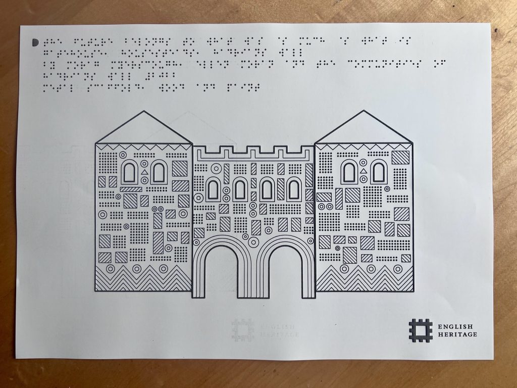
“Something more than facts, please” – an A3 tactile diagram that uses shapes and textures to communicate the colourful complexity of the installed artwork.
Some people want to simply know what the thing is and go out and experience it. Some want to know facts. Some want to have a sensual not a factual experience. Some want all of it.
However, time is a big constraint. Reading Braille and understanding a tactile diagram can take time. Offering options allows people to choose.
This is the importance of autonomy in accessibility. Break your explanations into smaller chunks of content that can be provided in different formats to meet a range of visitor needs.
Offering autonomy requires staff knowledge
It is important to explain to staff and volunteers how any accessible interpretation materials are to be used. Autonomy needs support from people the visitor encounters.
This guide for the project explains:
- what the materials are designed to do and how they meet different visitor intents
- how they can enhance the visitor experience on-site using better welcomes, use of extra items and conversations
- what the materials are made of and how they might go wrong or raise questions
Finally there’s a telephone number to call (just in case).
Providing a good welcome is important and it is staff that enables this.
Want to try something for your project or place?
I am always happy to chat for free about accessible information design for any kind of project. Just email me (use the Contact Us page) or find me on Twitter @acuity_design.
Accessibility does not need to be complex or expensive. Just try doing something to build up your knowledge and to build up your relationships with people with differing physical and cognitive capacities.