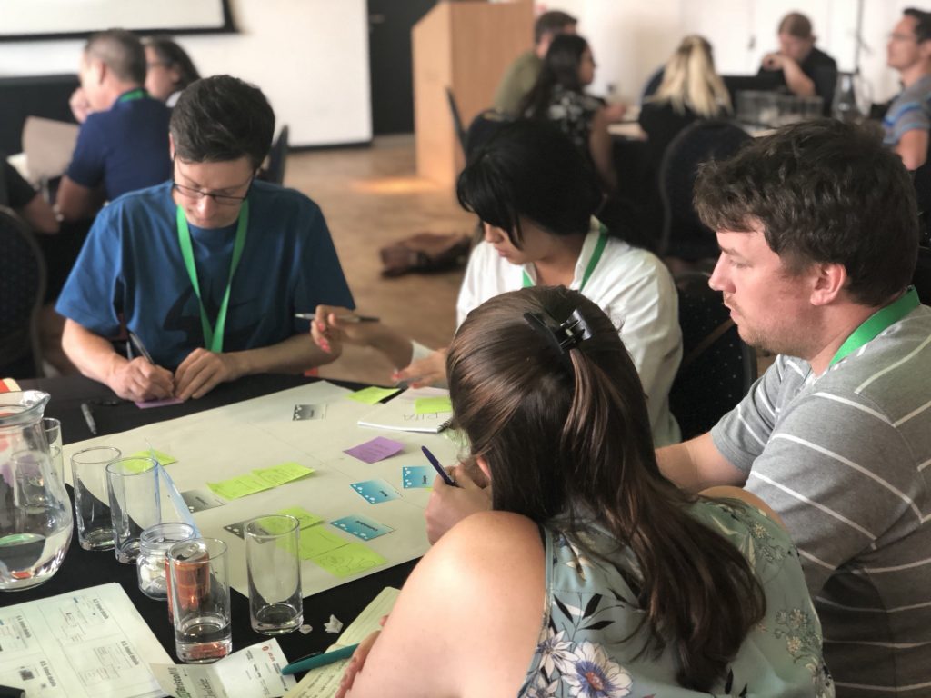
I ran a workshop at UX Bristol on designing forgettable experiences and used the EasyJet airline ticket booking system as a core element in workshop exercise.
I asked people to consider:
- How to redesign the system to enable people to make ethical choices during the booking. Particularly in terms of ecological sustainability.
- How to redesign the system to reduce stress to travellers with disabilities in terms of booking assistance and being assured that service will be delivered.
It’s the latter point that I’ll deal with here.
What does the booking experience look like?
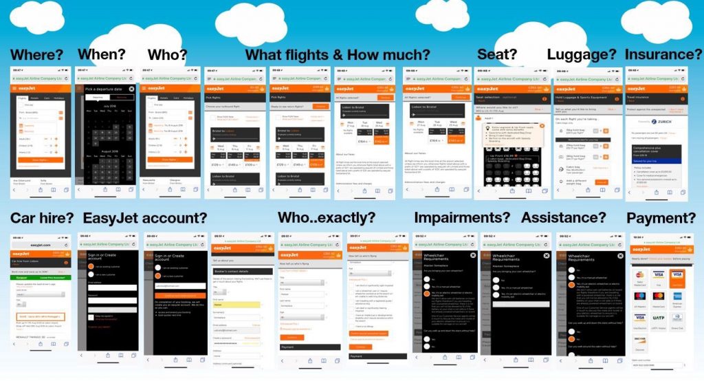
In a one hour workshop, I needed to provide clear information to participants so I screen grabbed the whole ticket buying experience.

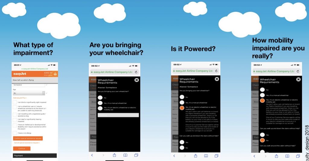
It’s only just before payment that disability and assistance needs are raised as an issue by EasyJet’s system. For a wheelchair user, answers to a set of additional sub-questions are required.

What seems remarkable is how inhumane the system is.
Change the system
The system treats personal impairment and assistance needs as an add-on while treating add-ons, like car hire, as essential.
That’s ridiculous.
It talks of specific seat bookings and luggage costs before considering who might have essential and practical needs for such services.
That’s awful.
It asks questions about personal capacities and assistive technologies in terms of illegality, inconvenience and troublesomeness.
That’s inhumane.
And none of it is necessary.
Reordering elements
Change the order of booking process just a little bit, ask about impairments earlier so there can be meaningful discussions of seating and luggage. Where a person with mobility impairments wants to sit on a plane is predicated upon their own awareness of their own ability to walk.
Putting the seat booking interaction before the disability discussion appears to be done only to avoid the non-revenue generating offering a person with disabilities a seat that meets theirs needs for free (as required by EU law).
Creating a rudely direct survey about mobility capacity at the end of the booking process is treating the person and their own sense of self as a problem to be analysed not enabling a person’s autonomy.
Making the luggage decisions before the discussion of how carrying electric wheelchairs is problematic for the airline makes a single conversation about hold space and costs into two discussions (one about personal belongings, one about assistive technology)
Just respect people and help them enjoy their travel.
The UX shown here is designed to maintain stress and reduce autonomy. It creates a needlessly memorable bad experience for travellers with disabilities and it needs to stop.
PS What happens at the airport?
Something the whole booking experience fails to mention at all is what the assistance service at the airport will be like and whether it is reliably delivered. This tension over what will happen and what might not happen then hangs over the person’s travel plans.
Interestingly, on the day of the workshop, a report was released on airport disability services and it shows a quite positive message. Airlines, like EasyJet, could help make travel more inclusive by showing how they work with airports to enable the lives of people with disabilities.