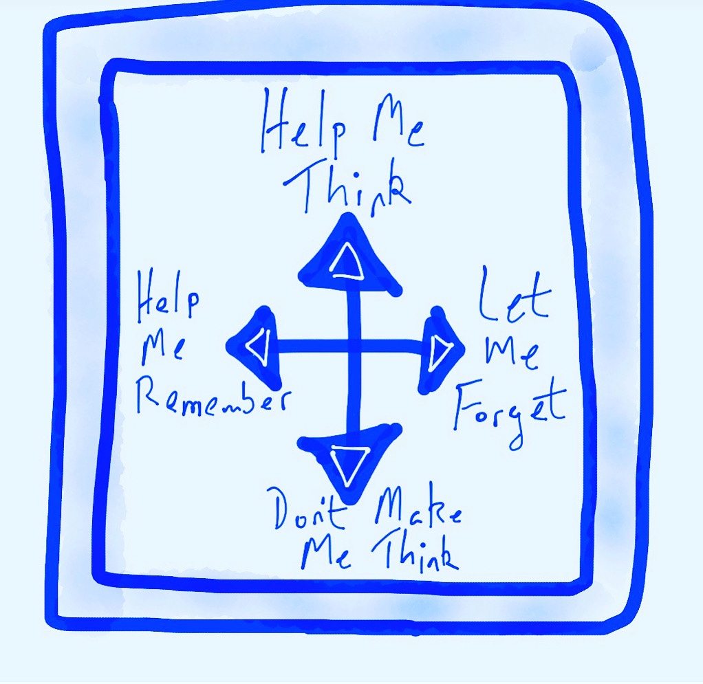
In 2018 I was doing work on Forgetting in design. This was mostly due to a mix of work in Dementia and human centered design concerns about the demand for Memorability made by some products and services. I’ve come back to this diagram due to work updating the SensoryUX workshop I have been running since 2014.
What is relevant here is new research into the neuroscience of Anticipation and Metacognition. The issues not of memory (as shown in the diagram above) but of Thinking (the other axes).
Perception

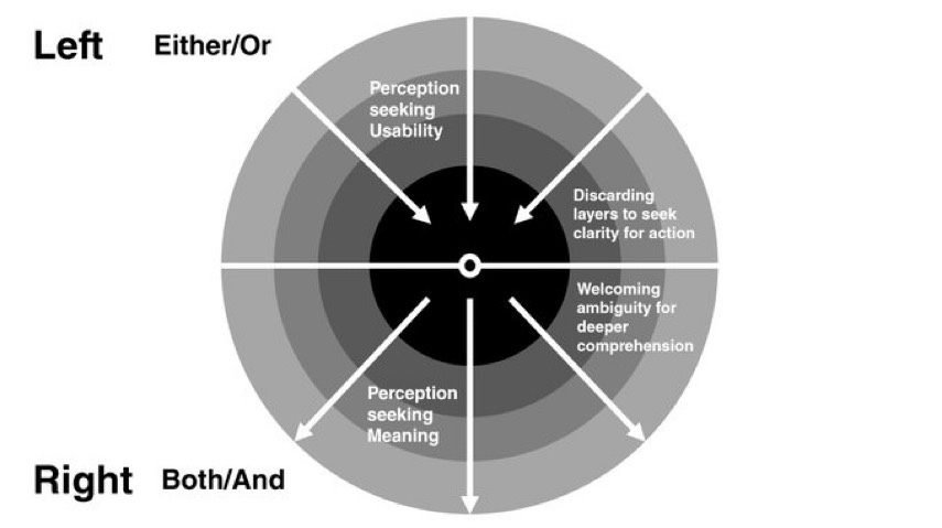
The Left/Right hemisphere idea of Perception here is a reference to Iain McGilchrist’s ideas raised in the second half of this BBC interview for Thinking Allowed.
What he was concerned about is how much we support the simple clarity of Left. The Black & White dichotomy of Either/Or. Digital design is particularly captured by the ideal of fast A/B decisions and interactions. Speed confused with efficiency.
This sense of Left perception is about the person seeking Usability – the desire to do something here and now.
The Right is more open to complexity and ambiguity. However, these are viewed as problems not virtues in most design terms.
Certainty

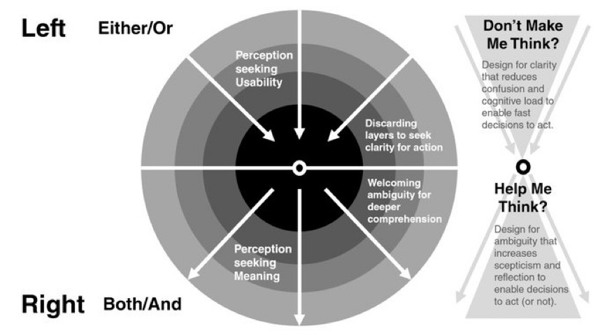
Don’t Make Me Think has been a mantra for UX for some time. It is a good idea: reducing confusion and lowering cognitive effort are positive design goals.
But…
What if these positive design goals turbocharge the bias to Left hemisphere perception? If that individual sense of perception is already seeking usability by ignoring current senses and swerving around complex ideas and memories, then design is accelerating those biases.
Certainty is one idea raised in Metacognition theory. How people shift their certainty in their own sense-making in different contexts to enable decision-making. Certainty can plaster over ambiguities to enable action.
Yet certainty can also mean a person does not look more critically at their current situation. The smoothness hides deeper meanings. The shadows that are removed, the details that are hidden could have led to deeper comprehension and better decisions.
These are all elements of the Right. Comfort with ambiguity and the time taken to consider contextual uncertainty. Not fast, not easy.
This is the ‘Help Me Think’ idea of design. How to support uncertainty in both how content is provided and how people feel comfortable in taking time to process and critique their uncertainty.
Confidence

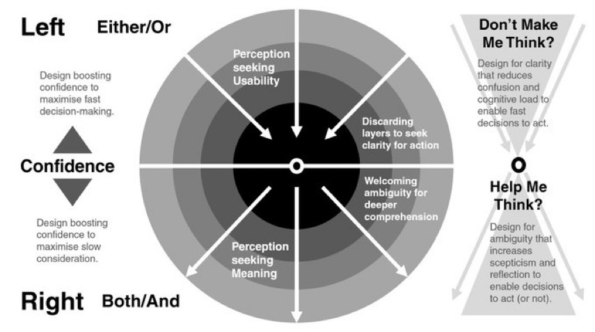
Finally, the metacognition idea of Confidence.
If Certainty in perception can be shifted to Left and Right to enable faster action or longer contemplation, then Confidence is the more overarching sense of personal capacity in meeting intents.
Confidence matters when approaching a product or service. Both under- and over- confidence have contextual utility.
Confidence can bridge gaps where a person believes they can do something that goes beyond their historic capacties.
Lack of confidence can brake a person from taking an action that they could do but perhaps should not.
The feeling of confidence can swerve a person towards Left or Right – towards the jump to action and towards standing still, thinking.
Again, the idea of ‘Don’t make me think’ is about enabling confidence bordering on over-confidence. Making the decision, doing the thing now. The simple cry of ‘Do it now!’.
Design for under-confidence looks dull and controlling. It is too often the content design of Warnings and Error Messages. The many ways of asking ‘Are you sure?’.
Yet it is that design that is needed. Better ways of helping people think.
How this is achieved I am not sure. This is just an opening post.
As with work on Dissent, I suspect small actions and communal connections will be valuable.
The design voice of Authority might be helpful in boosting confidence to act but its intensity of power can be damaging when talking of under-confidence and uncertainty. The voice must come with a sense of equality and empathy. It is better to enable the voices within communities, families and friend groups than broadcast. The sense of confidence and trust spreading across communities to support uncertainty and provide the space and time to think better about what to do.
‘Help me think’ is about design letting go. ‘Don’t make me think’ has clear tramlines, processes and outputs. Help me think is much less clear (at this point) but offers healthier and more sustainable lives for many of us.