Acuity Design is starting to test new ways of designing and making tactile maps and diagrams.
Now we have a ZyChem swell printer it is much easier to run short tests and make prototypes.
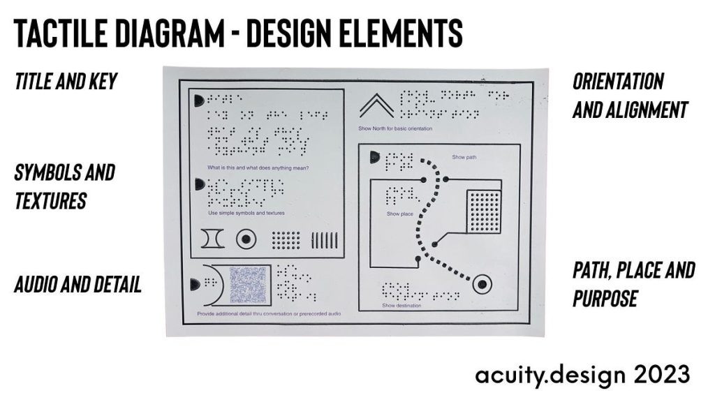
This test page is about 5 design elements.
Title and Key
The need for a title and key to describe what is being represented and how meaning is held. Without vision, there is no quick glance. There must be clarity delivered as soon as possible.
Symbols and Textures
Defining the use of symbols and textures within the diagram. There are a limited number of readable tactile symbols so meaning is reallocated on each diagram as symbols are re-used. Thus symbols and textures need explaining in anticipation of diagram reading.
Audio and Detail
Adding detail thru conversation or pre-recorded audio (accessed by QR code). Tactile diagrams cannot carry too much information. Either they become too complicated to be readable or so complex that too much time is spent acquiring information. Use the diagram to establish the cognitive map and audio to fill in detail. QR codes and mobile devices offer a way to reuse text content simply.
Orientation and Alignment
Offer orientation and alignment information thru borders and arrows. Knowing which way you are to the diagram and the place is necessary.
Path, Place and Purpose
The map is not just a diagram of a place. It is to support a person in their intentional journey. Do not just show a place, offer destinations and paths (tho in some places, too many paths can become too confusing too).
Over the next few months, we will be making and testing some other ideas for tactile diagrams and maps.