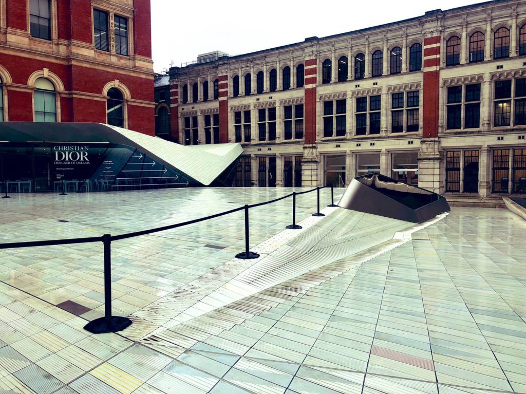
I was at the Victoria & Albert Museum in London yesterday. They have a new entrance plaza. It looks lovely.
It does however, include a new form of textured paving that is quite awesomely bad for accessibility.
For a museum that is proud about design and actually has exhibitions about design and disability on at the moment, this is not good.
I’ll explain why the new surface is bad and then provide a couple of problems in accessible design in general.
Innovative inaccessibility

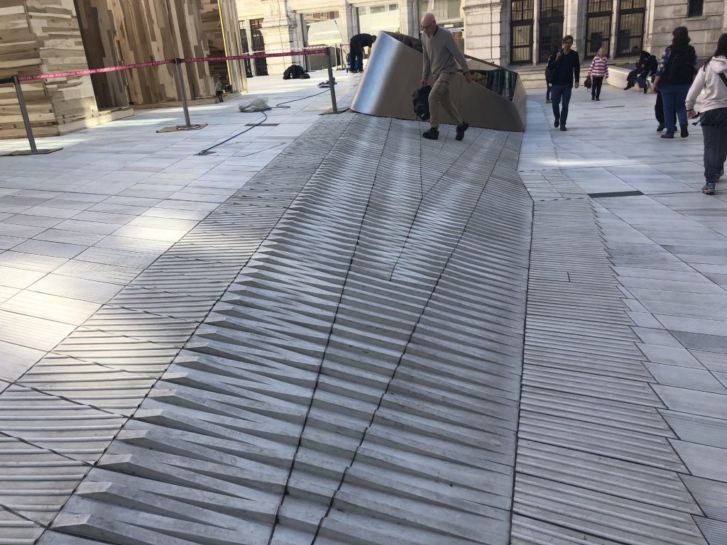
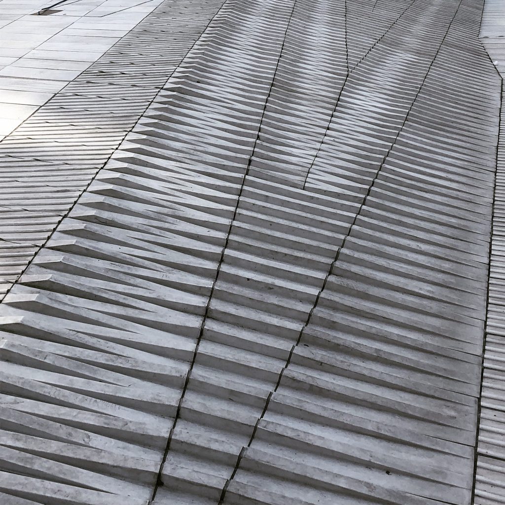
This surface treatment and pattern is completely new to me. It has edges, slopes, shadows, textures and more.
It is bad because (and this is the only the most obvious problems):
- It is hard to discern how to walk on it (particularly from the top edge). The novelty creates uncertainty for people who may not be confident walking.
- It has hard edges and shadows that make perception tricky (for people with low vision and people with dementia).
- It has edges and gaps that can trap guide dog paws, wheelchair rims, walking sticks, crutches and white sticks.
- It has shiny smooth surfaces that can create slips for certain shoe types. I’d not like to imagine what it is like in Winter with ice or snow on it.
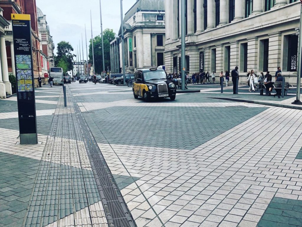
Overall, it is bad. It’s also inexplicably bad. People chose to design this, authorise its use, manufacture it and install it. Did no one notice? Were no people with impairments asked to comment?I suspect it got through because it was only seen on 2D maps and in simple 3D mockups. The experience of Shared Space schemes (and the V&A adjoins one in Exhibition Road) does show how badly wrong public realm design can go; even with consultations. Textures and surfaces are very hard to judge from standard architectural diagrams.
Novel surfaces like this one demand a higher level of proof that they do not create disability.

That design is where disability and exclusion lies can be hard to understand. It is worth knowing about the Social Model of Disability.
Disability in design
Disability is nowadays defined by the Social Model. In this model, it is the design that defines the disability not the person or their impairments.
Thus places and products are disabled and create inaccessibility as person is unable to go to a place or use a product.
This is why designers and architects must be human centered. Simply being innovative and creative is not enough. If the design idea has embedded disability then it is a failure (however lovely it looks).
Disability invitation
There is a phrase I use in accessible design workshops:
If it doesn’t look accessible, it isn’t accessible
Museums, as a place I know well from work, are often quite good at being accessible within their buildings but they remain terrible at showing that they are accessible.
The invitation is missing.
Both on websites and in entrance halls, there is a failure to show accessibility.
Sometimes it’s because the museum does not consider the (in)actions of their partner organisations. Travel and travel costs are a huge barrier to museum visits but are under the control of other companies and government agencies.
Sometimes it’s because museums do not consider how they welcome people in. The entrance hall (and the space outside) are crucial to the visitor experience. If they do not provide services or explanations to the visitor at the start, then museums can be strange new places with an overwhelming sense of anxiety.
Invitations matter to visitors.
Welcomes matter to visitors.
In the end
In the end, it’s just a sense of tiresome resignation about all this.
That novel surface is inaccessible. It is bad for many people with physical and cognitive impairments in ways that are well known.
It creates a welcome experience that shows a lack of thoughtful care and a lack of invitation to people with differing needs and capacities.
Innovating inaccessibility is something we need to stop and yet we keep doing it. I suspect because we still do not have design processes that involve or respect the knowledge of people with disabilities.
And, finally, respect means more than listening. It means power. That new surface outside of the V&A got thru multiple layers of consultation but no one stopped it being laid down. Consulting people with impairments is not enough. They need to have the power to say No to people with privilege like architects and museum directors.
Without power, without respect, without involvement then this kind of Inaccessibility will keep on being made and remade.
Post Script
I popped into the V&A a few months later to re-look at this space after someone told me it was deliberately designed to be inaccessible.

It is a horrible day today so there’s not much pedestrian through put and they have also fenced off quite a large area of the courtyard so walking routes are restricted.
In terms of the surface:
On review, it does look like this is a deliberate piece of ‘non-space’ architecture. It is designed to make people wary of trying to walk on it and to make it hard if they choose to do so.
However, that design choice means they have chosen to do something bad.
They seem to have had a choice between making something clearly inaccessible (maybe steps or a walled area) or making something that was situationally inaccessible (a person must perceive the space and judge their capacity to use it).
This is very tricky.
Enabling autonomy and agency is fundamental to human-centered design.
However, enabling by creating anxiety is not good.
This surface pushes the difficult design decision onto users. They must assess and choose what to do.
That’s fine if you have normative sense of personal physical and cognitive capacity but a terrible idea if you don’t.
Returning to the earlier theme of invitations and museums: why would you induce anxiety as part of your welcome?
So, in conclusion, I was wrong to think that this was a thoughtless piece of inaccessible design. It isn’t. It’s a thoughtful piece of inaccessible design that is actually worse.