On the bias to judgement in visual dichotomy and arguing without observation

I know, and I’m sorry, but this is about that damned path photo about Design and User Experience.
Copenhagen Bike Lanes
I was reminded of it because of this tweet about Copenhagen traffic.
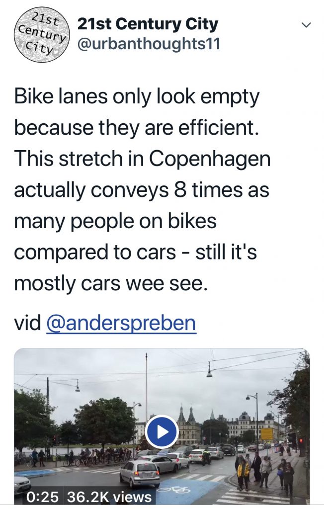
Looking at the photo, the empty bike lane is misread as showing it is not popular. There are lots of cars so there must be a great need for more car roadspace.
The photo (short video if you can watch that) proves the argument that bike lanes are wasted space.
Yet, per count data, the bike lane transports more people. Its efficiency makes it empty, not its wastefulness.
That photo of paths
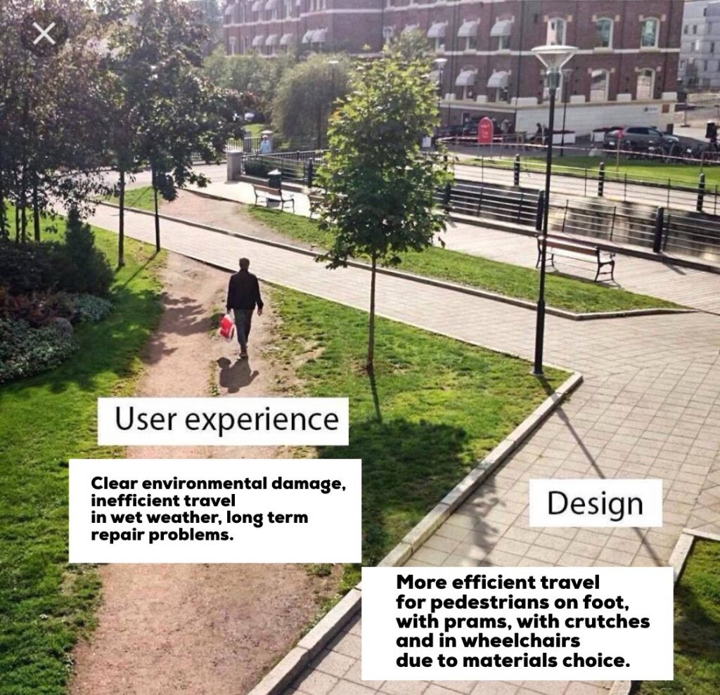
And so, perforce, we return to that photo.
Even with different explanations, as added in above by me (from an accessible and sustainable design angle), the bias of people I talked to on social media was that the muddy path proved how desire lines show user intent.
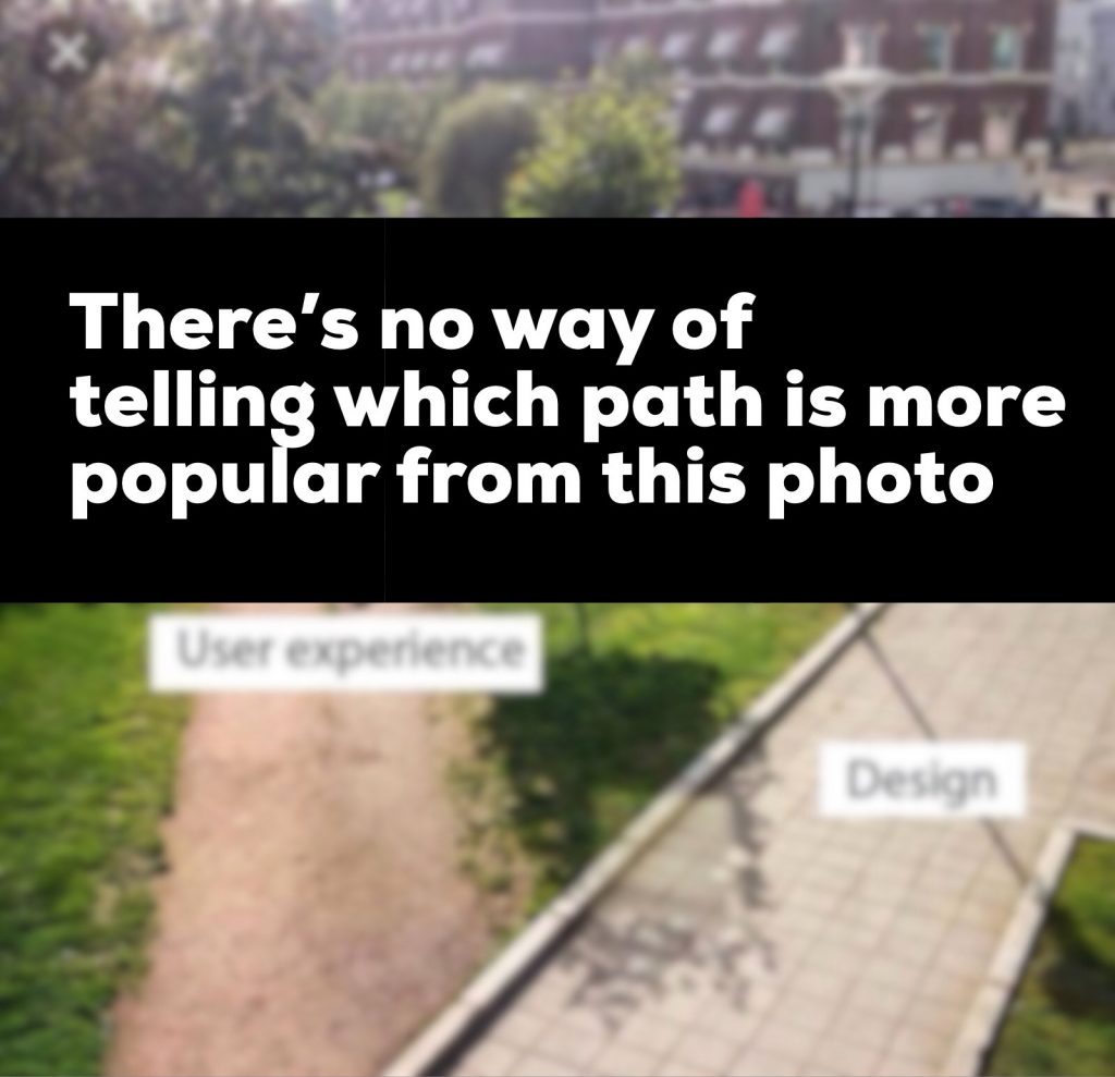
But we don’t know.
Comparing muddy paths and paved paths visually is impossible. It’s easy to trash an open piece of ground. It’s hard to wear out stone paving.
Without observational data, the photo is meaningless.
Muddiness is not good data.
Like the cars in the Copenhagen traffic queue, we are tricked in a dichotomy to judge the thing with most apparent human use as being the most popular thing (that figure walking on the muddy path is affecting you more than you probably think). The solidity of the paved paths and the lack of human traffic on them makes them seem less valid.
The moment captured is not enough.
Have an opinion
Sensing, having a sense of personal perspective and having an opinion are all part of being a sentient being.
It’s just sometimes we get sucked into having an opinion without knowing enough.
I did that with the adapted photo and talking about accessibility and sustainability. Perhaps it’s a different perspective and different opinion but it’s still based on not knowing enough. It’s easy for professional knowledge and opinion to fill in the gaps of not knowing.
The difference between the Copenhagen bike lane photo and the paths photo is we have observational data about actual use. The bias to think that human activity proves use while emptiness shows lack of use can be countered.
The damned path photo keeps leading to arguments because we don’t really know which path is popular.