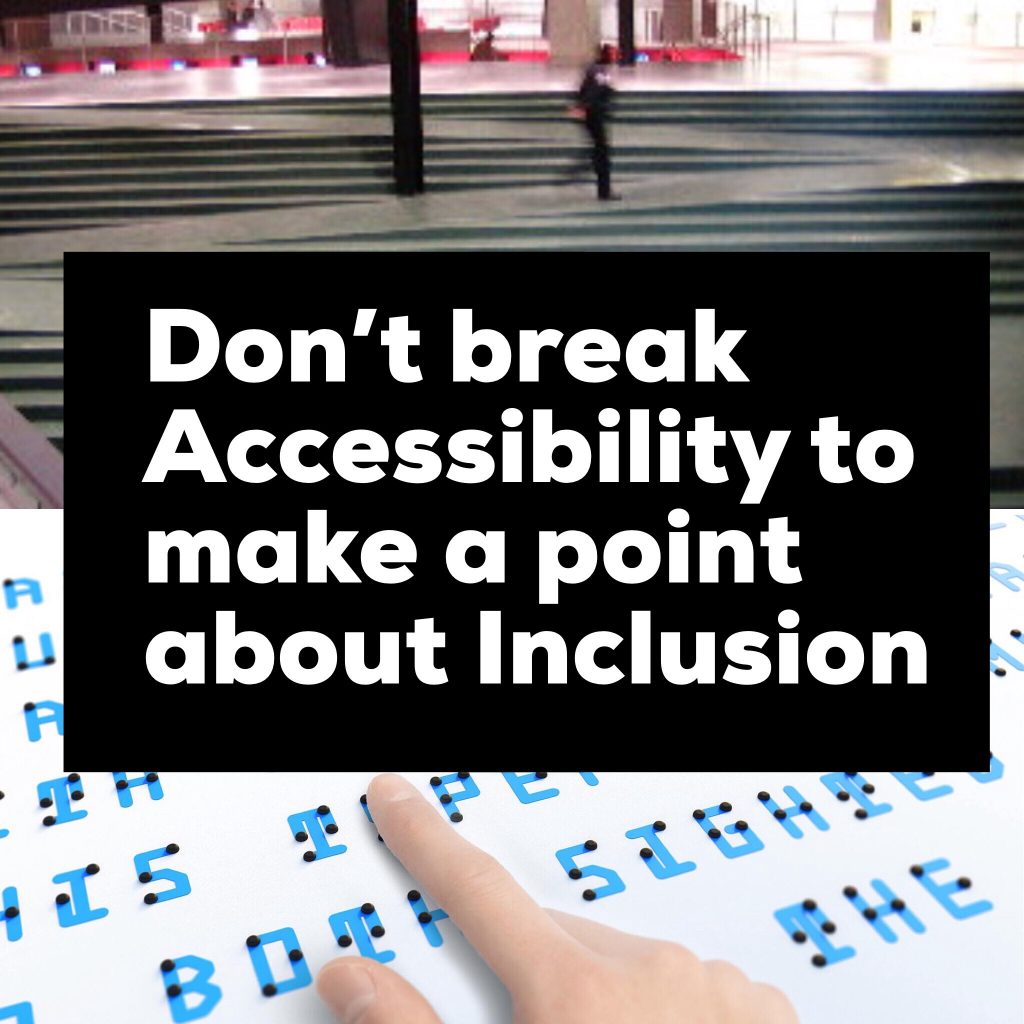
This post will seem cruel but it is about an important issue in the space between accessible and inclusive design.
Tokyo 2020
The Olympics in Tokyo in 2020 offer the possibility of some great new design for inclusion. Japan, due to its ageing population, has been ahead of most countries in public and urban design for accessibility. Building on this foundation with innovative new ideas will be exciting.
Lately, there has been discussion of a new combined visual and Braille font called Braille Neue. Here’s an article from FastCode.
This idea is quite appealing.
It looks great.
It is however, silly.
That cool ramp
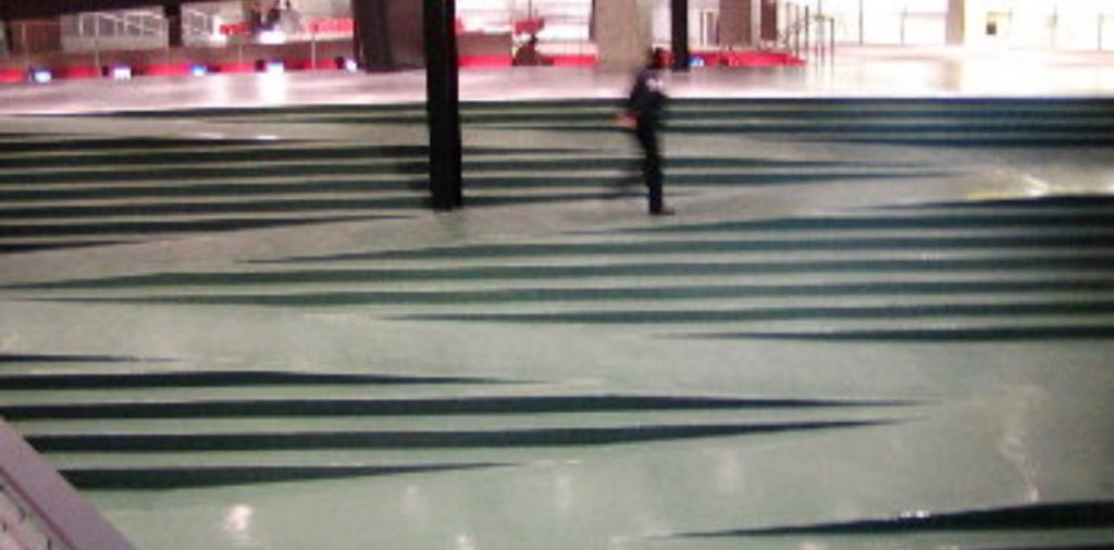
I am reminded of discussions, maybe 2-3 years ago, about that combined staircase and ramp in the photo above. It is in Vancouver in Robson Square.
Again, it looks great.
Again, it got lots of coverage as cool design
Again, it was silly.
The practical problems were that:
- for wheelchair users: it was too steep
- for people with walking impairments: there were not enough handrails
- for everyone: there were trip hazards
Looking cool and being usable is entirely possible but we need to point out when it doesn’t work.
Reading Braille
Returning to the combined Braille/visual font design, the problem is kerning.
This is a photo from a gallery interpretation panel we made a few years ago. It uses a UV printing technique to combine full colour and tactile elements.
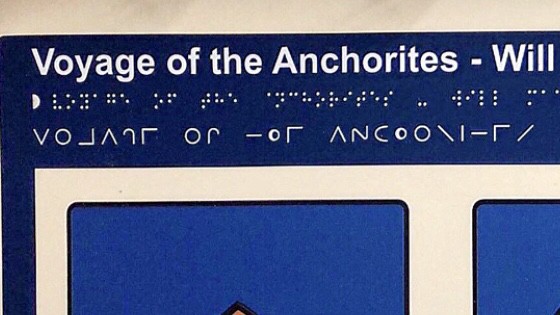
There are three fonts used:
- Large print Sans Serif visual text
- Braille tactile font
- Moon tactile font
What you need to understand is spacing (kerning) is a major issue.
Braille works because it is compact and readable (Moon is an old tactile font that is interesting as an intermediary visual/tactile font but is only really usable in quite restricted ways).
It is worth knowing that, for advanced Braille readers, the three fingers used to touch and read Braille become combined (in the brain) to create a single reading pad. This enables speed in reading and is one key reason for its use in education and professional work.
Spacing Braille out breaks its readability in a way that spacing out visual text does not. Spacing visual text is aggravating but not actually terrible. Spacing out Braille (as it is read in a physical way) is terrible. It increases the time to acquire information in a way that large visual text does not.
The problems of this new font are that:
- It is not enabling, it is disabling.
- It is not inclusive, it is exclusive.
Breaking real accessibility for a dream of inclusivity is not good design.
The combined stairs/ramp was the same problem. Looks great, shared widely as an image, doesn’t actually work.
Sharing space
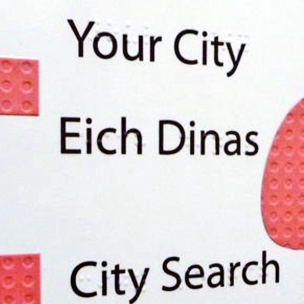
It is quite possible to combine tactile and visual graphics. UV printing has been hugely helpful in enabling this.
The above picture is from a Welsh museum and combines visual and tactile. The tactile elements are made transparent so visual design is not affected.
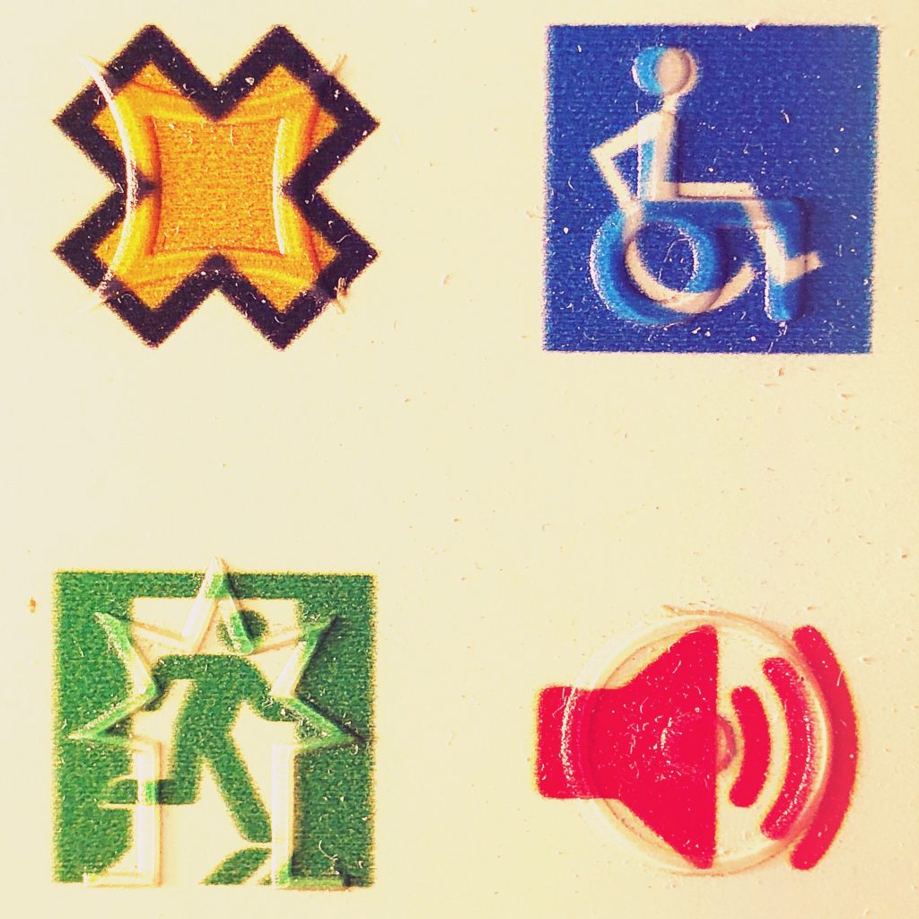
Similarity, it is possible to make symbols that overlay visual graphics but deliver meaning in tactile ways. The following photo is from a tactile design symbol sampler we use. Not all visual symbols (or their underlying metaphors) transfer well to tactile so sometimes they need clarification through simplification or a completely different symbol is used.
Collocation of visual and tactile information raises a lot of design and social interaction issues as this photo below shows.
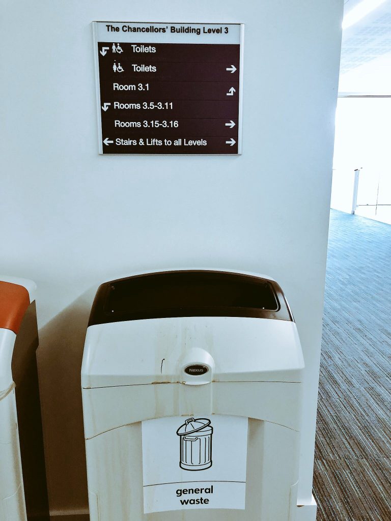
Wayfinding that integrates visual and tactile information sometimes presumes that people with visual impairments can reach and read Braille or tactile symbols in the same way that people without visual impairments can sweep and take in information. Sight and touch have very, very different ways of presenting information at a distance. Reach is an important issue. Putting a sign above a smelly bin, as in the photo, shows a shocking lack of awareness and respect.
Promoting inclusion
The new font does helpfully make apparent the relationship between visual and tactile lettering and, in that sense, is a helpful intermediary.
As a way of showing the relationship between meeting the information needs of visually impaired and unimpaired people, it is helpful.
However, like Jumbo Braille, it is a question of whether breaking Braille readability and practicality to make a point about inclusion is worth it.
As an art project and provocation, it is excellent. As a design project then there are issues.
- Talk to users
- Really there is only way to end this article.
- Talk to users
- Listen to their concerns
- Respect their capacities
Inclusive design extends the benefits of good accessibility to a wider audience.
Bad inclusive design compromises good accessibility.
Don’t make something cool if it reduces access to users with essential needs.
If you do want a good inclusive design story then there are lots of them in Audio design.
Wayfindr and SeeingAI are both products developed with people with visual impairments that have great futures due to their inclusive design for everyone. ‘Sounds Good’ inclusive design is a great thing.
Epilogue
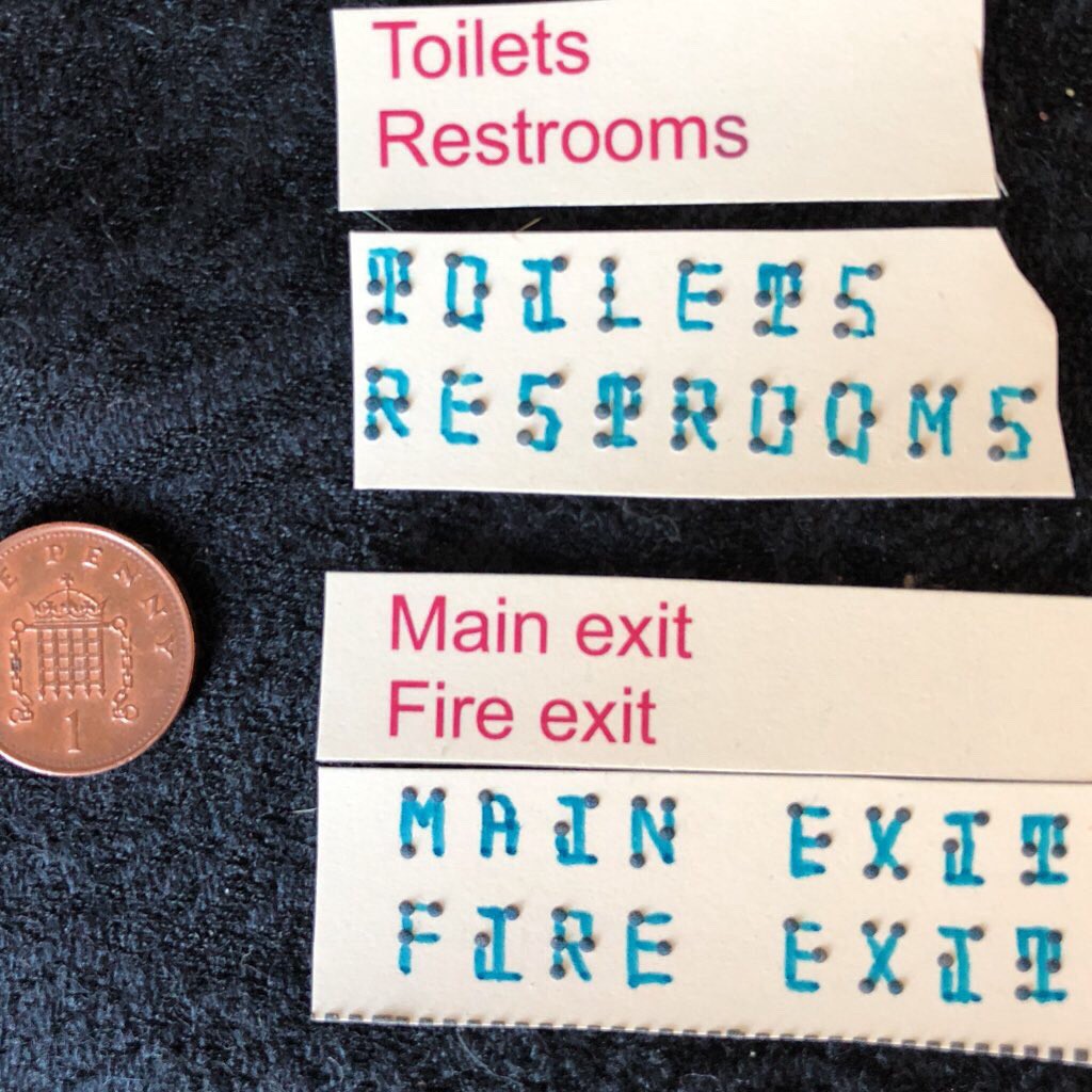
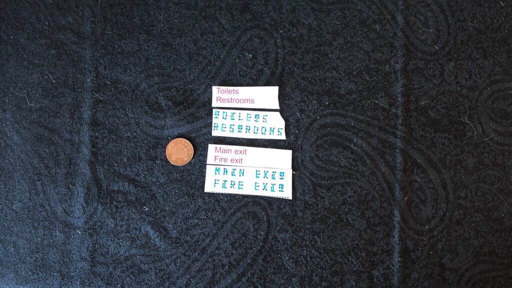
In a Twitter discussion with Joe Lanman, the question of if my issue with the font was only with the Jumbo Braille nature of the sampler came up. So some testing seemed a good idea.
I have a lot of Swell Print Braille due to a workshop on tactile map making last week. I have used them as the Braille is standard size
In general, the monotype format of the font holds when physically printed but there are a lot of clarity issues. The font is almost Gothic with its Serif elements to join up with the Braille dots. That creates some readability problems in close up (as shown above).
The problem is more pronounced at a distance (which is important for a wayfinding font).
Removing some of the more arcane parts might enable greater clarity but, as discussed in the main article, the question remains if it is worth it.
If you use Jumbo Braille (as in the original sampler) then visual clarity is prioritised over tactile readability. If we use standard Braille size (about 20–25 point depending on manufacture method) then visual clarity is reduced.
The question remains:
Is it worth reducing accessibility of information to make a point about inclusion?
I would still say no. Use Braille and use large font visual text but don’t try to unify them. It’s too much of a beautiful mess.
It remains ‘Looks Good’ Inclusive Design and that is a problem.