Emotion in design is mostly discussed in terms of inducing or guiding it to form a positive experience. How content is formatted is to drive towards a peak emotional state (normally happiness and joy with playful detours through fear and anxiety).
Healthcare however, has different goals. Strong emotions are in play at the start. The need is not to create an emotional peak but to take it and form it to enable positive action by the person. Compassion needs different content design.
Clarity as problem
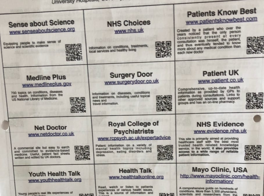
Here’s some content. It’s all QR links to valid and reliable sources of medical information. It’s clear, it’s concise and it’s all correct.
Put it in front of a person in a hospital or surgery and it may be completely useless.
Clarity is not always the immediate solution. Clarity is needed but not always at the beginning.
Buffering emotion
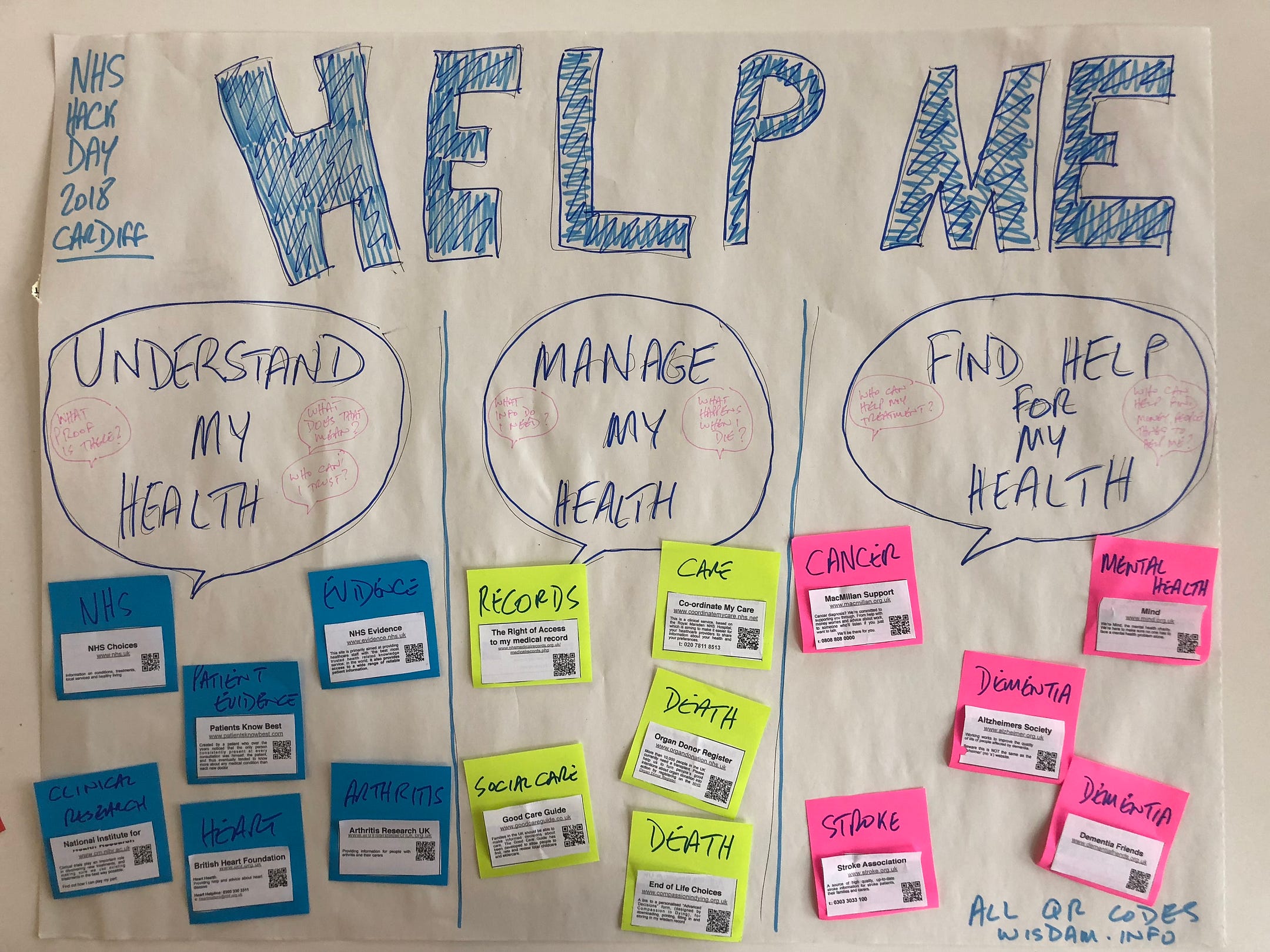
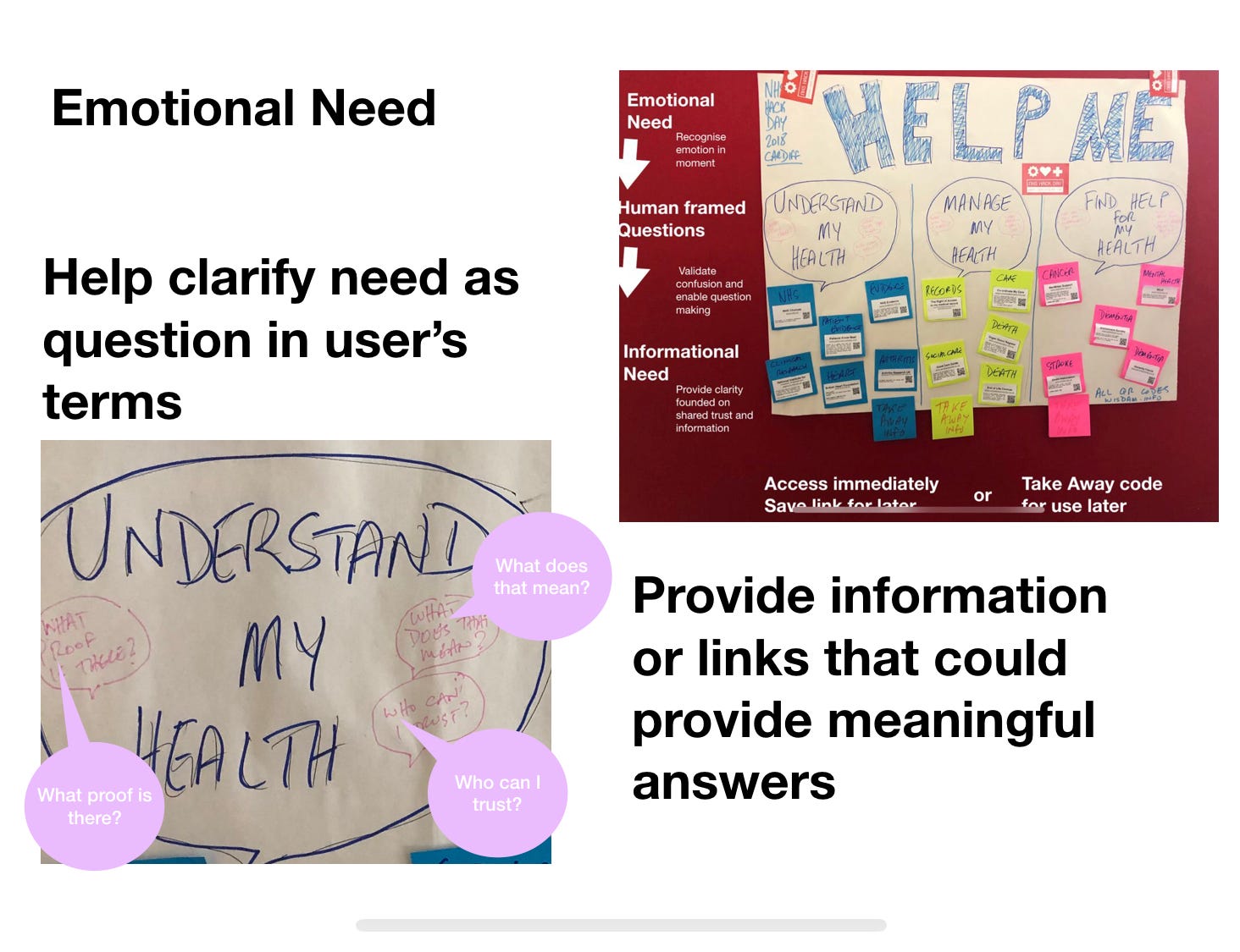
This is a paper prototype that cut up the QR code sheet and reframed it.
This is prototype made to have a conversation about human-centered content. All of the ideas it embodies and I discuss in this post are prototypes. I could be wrong, I could be right.
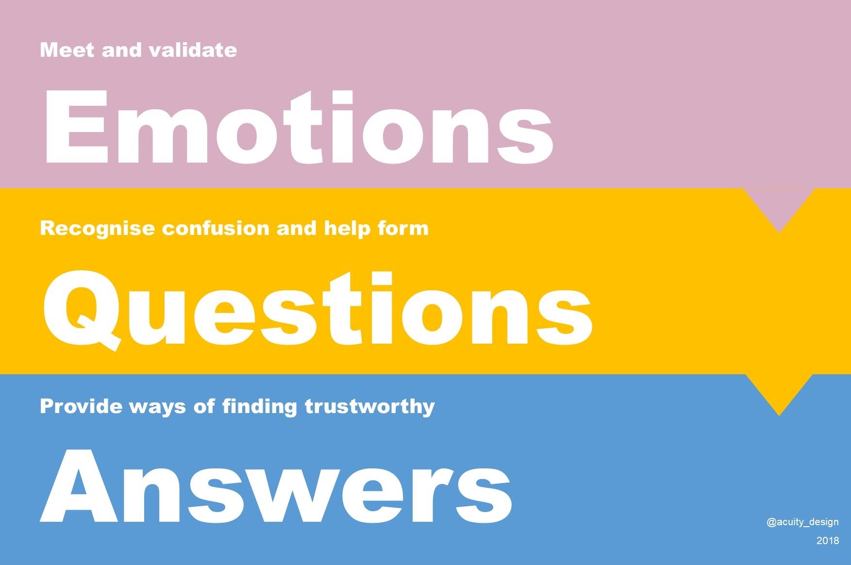
There is a sequence here:
- Emotion
- Forming questions
- Providing sources for answers
The process starts with the emotions. Clear information is not the answer when a person is overwhelmed by emotions about future treatments and issues.
Accept the emotion. Provide a place for it.
Don’t invalidate the emotion and don’t try to pre-judge it.
I know how you feel
Prejudgment will phrase the opening phrases in ways that could break the whole user journey.
There are two problems.
Firstly, demanding a specific individual emotional reaction to general events. The trap here is using a Persona for design that is not the actual user.
Particularly with a poster, it may not be the person who has a health issue reading the poster. It may be a partner, a parent or a friend. Their emotion will be a reaction to the emotion of their companion.
Don’t test with only the people who have been diagnosed. Look to the social group that share the moments.
Secondly, there is the problem of presuming that emotion will be exist and act in typical ways. Designing for cognitive accessibility means recognising that humans do not all have the same cognitive flows.
Don’t test with neurotypical people. Involve autistic people and people with other cognitive impairments to create inclusive designs.
Questions to seek meaning
Buffering emotion is to allow the person to catch their breath. They want help but there is still the swirl of emotion that will affect their ability to seek meaning.
Emotion constricts cognition.
Constriction of cognitive capacity is important as it affects everyone. From the brilliant to the stupid, the wise to the foolish: everyone.
So there is another buffer. Providing information for meaning making assumes the person knows what the question is.
With restricted access to cognition, that is not true here.
Providing some sample questions (drawn from research of previous users who have been thru this moment) helps.
Human phrased questions. Simple language. Raw demands.
These help guide the person. Agency regained and enabled by the experience of others humans.
Questions to seek answers.
Information when, where it is needed
The paper prototype doesn’t actually change the content. It’s the same information.
Yet it’s important to note that the information can be accessed at that moment, in that place or recorded and taken away.
Offer options for when a person looks at information. Here and now is not always the right time. Place, people and purpose change the individual’s attitude to when they can absorb information.
Start with the thing you cannot control
A lot of content design starts with the things that are under control. The words, the fonts, the graphics.
It works away from the designer towards the user.
That cannot always work.
Sometimes you need to start with the hard and uncontrollable things like another person’s emotions. Start with hard stuff to provide real help.
Also, accept that the design cannot absorb all the emotion and confusion. That is what other humans, professional staff, volunteers, family members and friends can do. This content design approach may be a tiny, helpful thing but it is in no way a complete answer.
Just to end: I’d highly recommend Design For Real Life by Eric Meyer & Sarah Wachter-Boettcher because it’s excellent on compassion and design.