I have been doing some work in mixed reality design lately (virtual and augmented realities) and some issues of what the User Interface (UI) for HypoReality could be have come up.
HypoReality is the idea that, instead of augmenting and adding more and more detail to real and/or digital environments, we enable users to strip back the experience to what they are comfortable with.
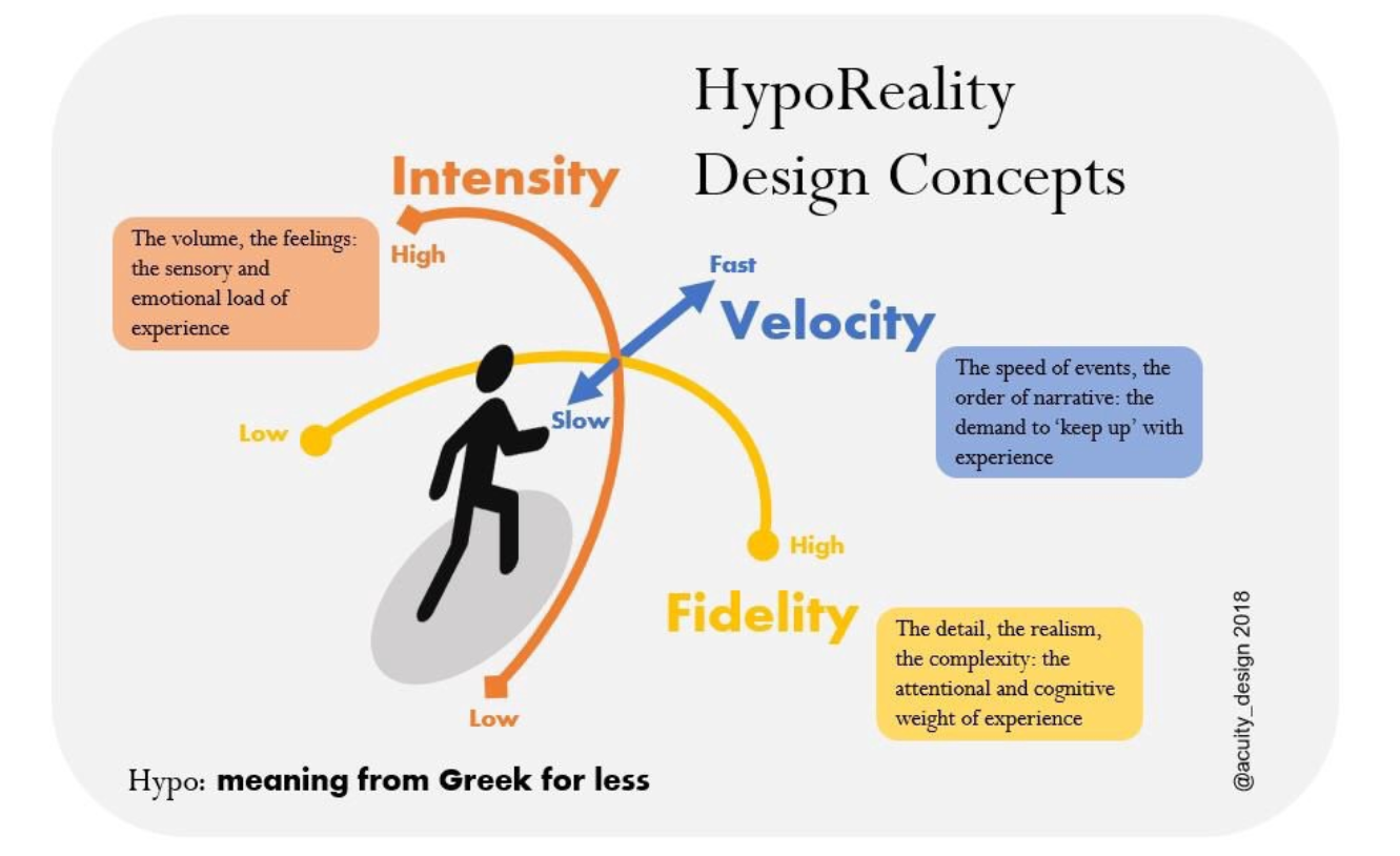
The diagram above summarises some ideas. The UI enables individual agency by allowing control of three elements:
- Velocity
- Fidelity
- Intensity
Velocity
How quickly an experience occurs can be problematic. It can often be a incomprehensible blur.
Enabling control over how quickly and in what order events occur may help.
That would mean controls over the speed of experience, the repetition of experience and the narrative order. The first two elements are relatively easy and related to Scrubbing tools in use already (rewind/fast forward, etc.).
Shifting narrative order or deleting elements is however, more complex. Chapter selection and some equivalent to Heading system used in Html might work.
Fidelity
How real does reality need to be to be a ‘good’ experience?
Video game playing, in particular retro-gaming, has shown that visual fidelity is not necessarily that important.
There is however, good research from the BBC that audio fidelity can make or break an experience.
Controlling fidelity could be achieved, especially when discussed in terms of the existing wire framing and architecture of digital products. The lo-rez prototypes of product development can provide a benefit in the final product as alternative versions.
These digital elements are normally covered up under pixel-perfect skins. There is a possible Modernist argument for revealing the structures to enable use.
Form follows function in digital design terms.
Intensity
This post started with the presumption of Attention Economy that is forcing people to pay attention and to be immersed in strongly sensory environments. This is clearly terrible.
So the final UI control is the obvious one — control over the sensory load of a place. The volume, the colour, the feel: all those overwhelming elements of perception.
This is the volume control for mixed reality.
UI for less experience
That’s all for the moment. I have some work and discussions coming up with people working in this area so I hope to learn some alternative ideas.
If you do work in Mixed Reality design and/or Human Computer Interface research and know something that might help, I’d be glad to hear and share.